75 Bar charts
Written by Matthew Wankiewicz and last updated on 7 October 2021.
75.1 Introduction
In this lesson, you will learn how to:
- Plot bar charts using the
ggplotpackage - Customize bar charts with
ggplot
Prerequisite skills include:
- Having
ggplotinstalled and loaded - Basic familiarity with
ggplot
Highlights:
- Bar charts are the best way to display categorical data.
- The
ggplotfunction allows you to customize your bar graphs.
75.2 The content
When you encounter a dataset that does not include numerical data, the best way to visualize what you are working with is a bar chart. Generally, bar charts will have the categorical variable on the x-axis, and the count/percentage on the y-axis.
Bar charts are different from graphs like histograms because histograms display numerical variables while bar charts work best for categorical.
Bar charts are useful for getting a view of how your data looks and seeing which groups appear the most.
75.3 Arguments
The main arguments for making bar charts is part of the ggplot function:
-
data: This represents the dataset you plan to use. You can either write
data = dataframeor you can pipe the dataset intoggplot. -
aes():This is where you place the argument that decides which variable you are focusing on.-
x = variable:This is the variable you want to display. -
fill = variable:This can change the fill of your bar depending on the different options in your variable.
-
-
geom_bar():This is where you put any arguments to change the looks of your graph, whether it’s colour or size of the bars.-
fill:This argument decides the colour of the inside of the bars. -
colour:This argument decides the colour of the outline of the bars.
-
- The
labsfunction is useful for adding titles and subtitles to your graph.
75.4 Other Optional Arguments
Some optional arguments for the geom_bar() function include:
-
width:This argument changes the width of the bars, it defaults at 0.9. -
alpha:Changes the transparency of the bars.
75.5 Questions
For this module, we will be using lemur data from Alex Cookson, https://github.com/tacookson/data/tree/master/duke-lemur-center.
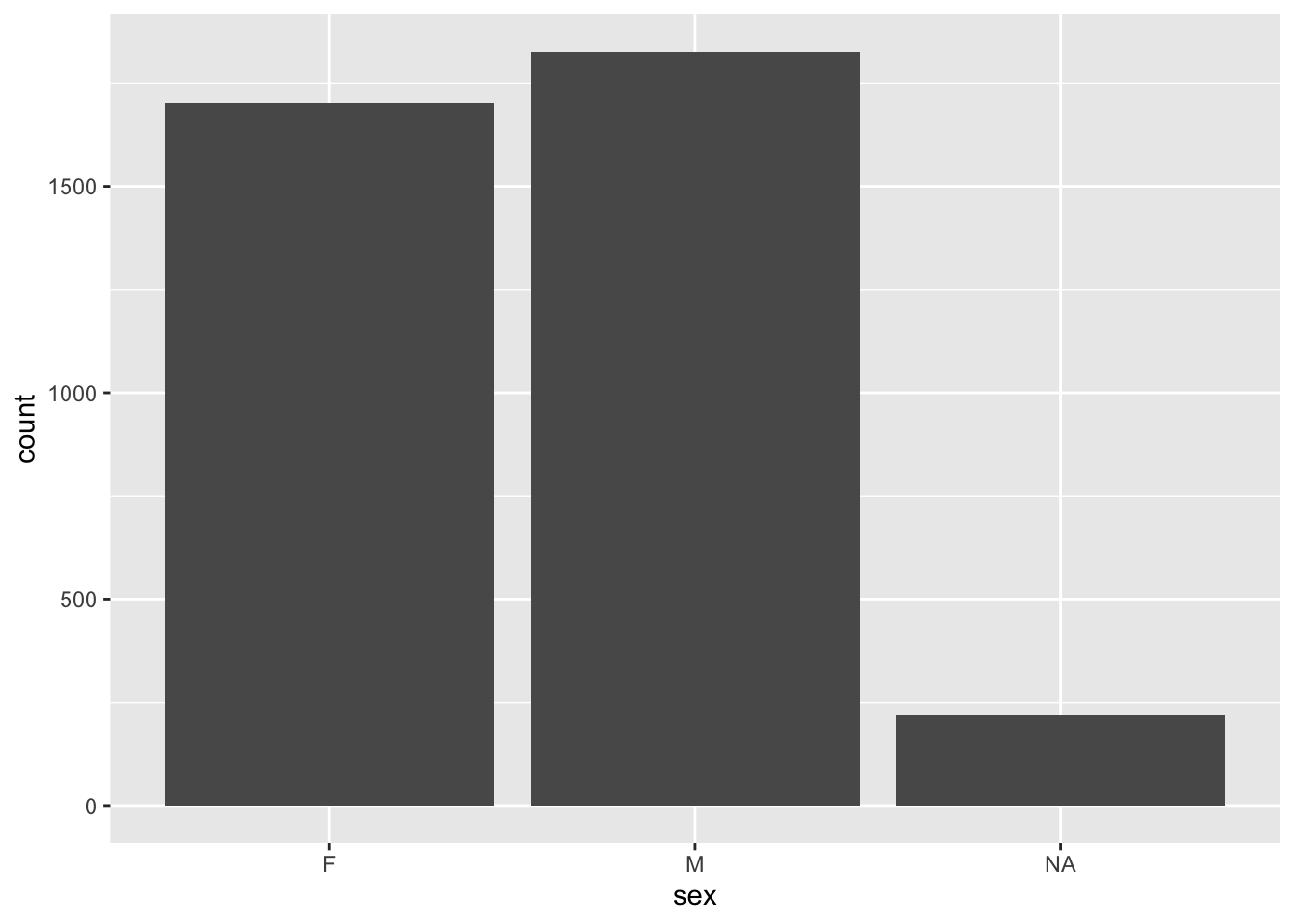
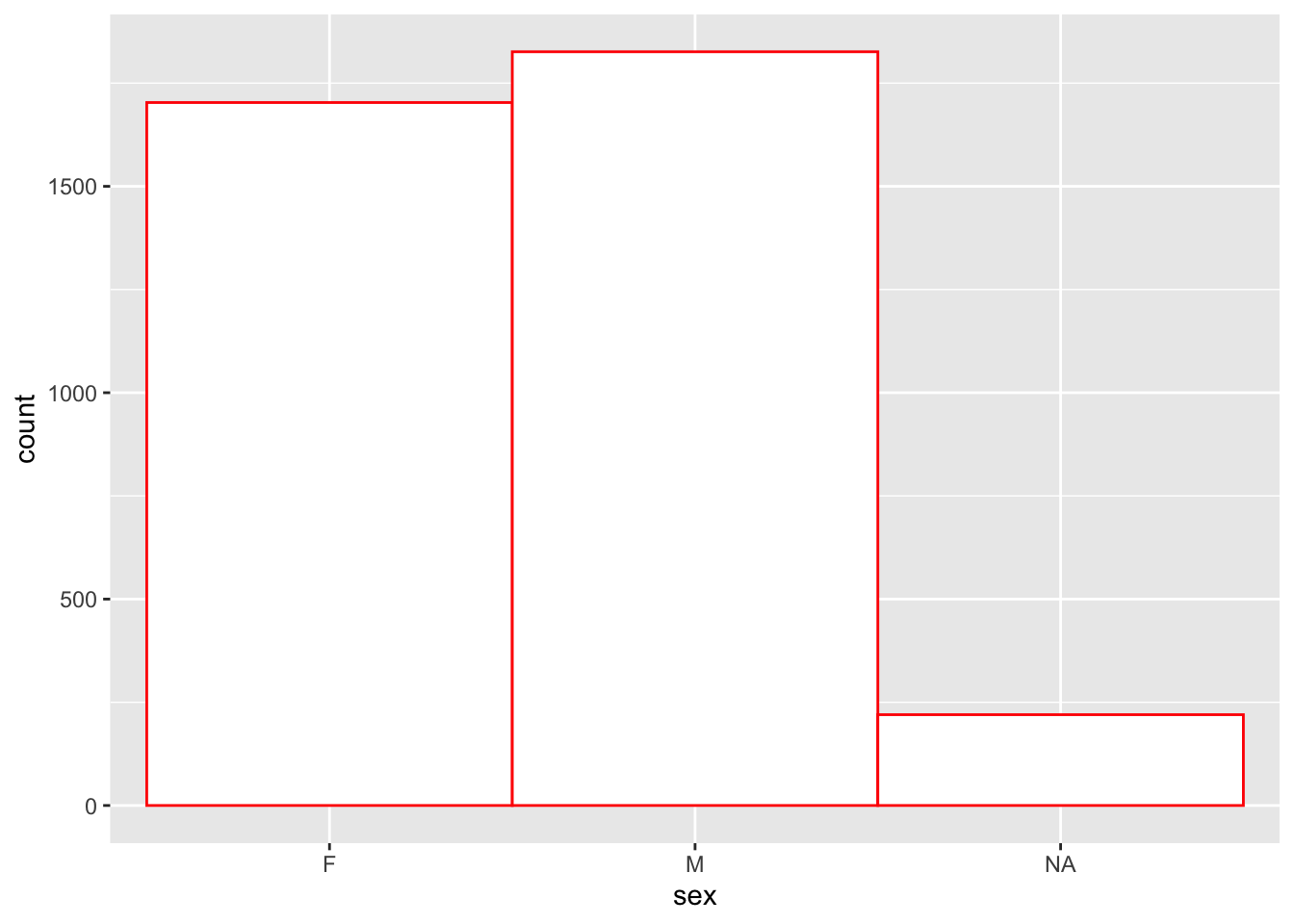
animals <- read_tsv("https://raw.githubusercontent.com/tacookson/data/master/duke-lemur-center/animals.txt")Let’s start with plotting a simple bar chart of the sex of the animals in the dataset. We will see that R names the x and y axis but does not add a title.
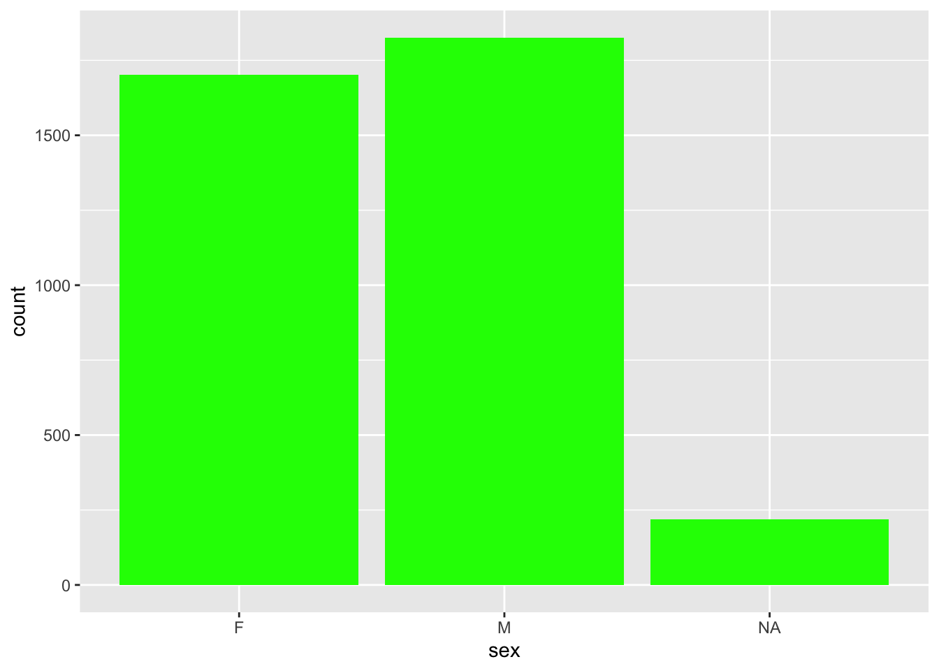
We can also change the colours of the inside of the bars, using the fill argument. If we set it equal to green, we will get green bars.
Similarly, we can also change the colour of the outline of the bars. If we set it to red, the outline of the bars will be red.
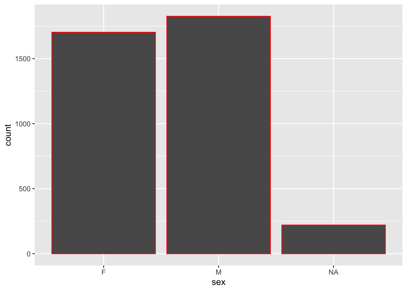
Both the fill and colour arguments can be combined in the same call of the geom_bar() function
You can also change the colour/fill by adding the argument to the aes() expression. Doing this will give a specific colour for each value in your fill variable.
75.5.1 Optional Arguments
Using the same data, we can change the width of the bars. Using a width greater than 0.9 will make the bars wider, and using a width smaller than 0.9 will make them thinner.
75.5.2 Adding labels to your bar charts
The labs function helps add labels such as titles, subtitles, and labels for the x and y axis.
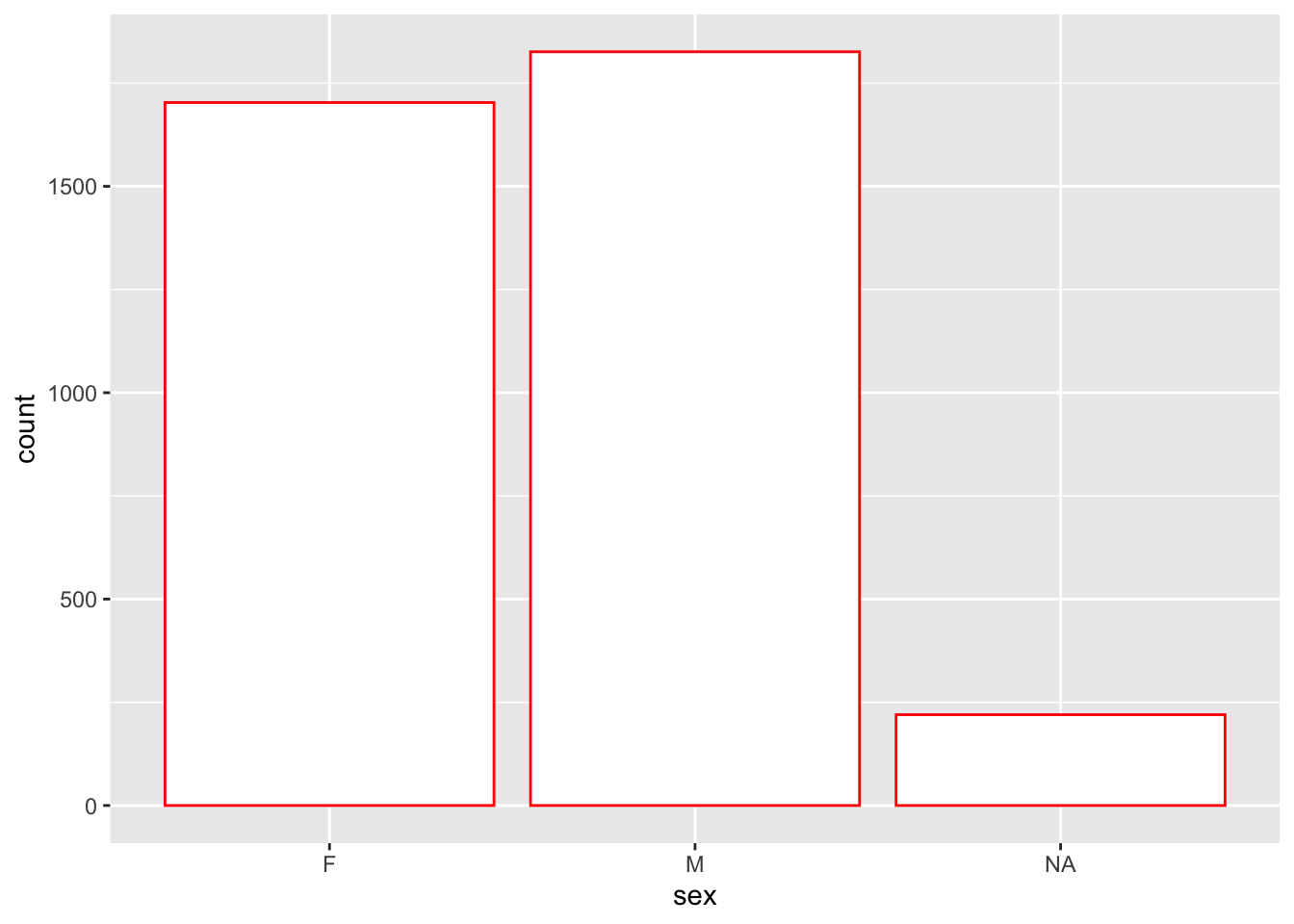
animals %>% ggplot(aes(x = sex)) +
geom_bar(fill = "white", colour = "red") +
labs(title = "My bar chart's title",
subtitle = "Using animal data",
x = "Sex",
y = "Count")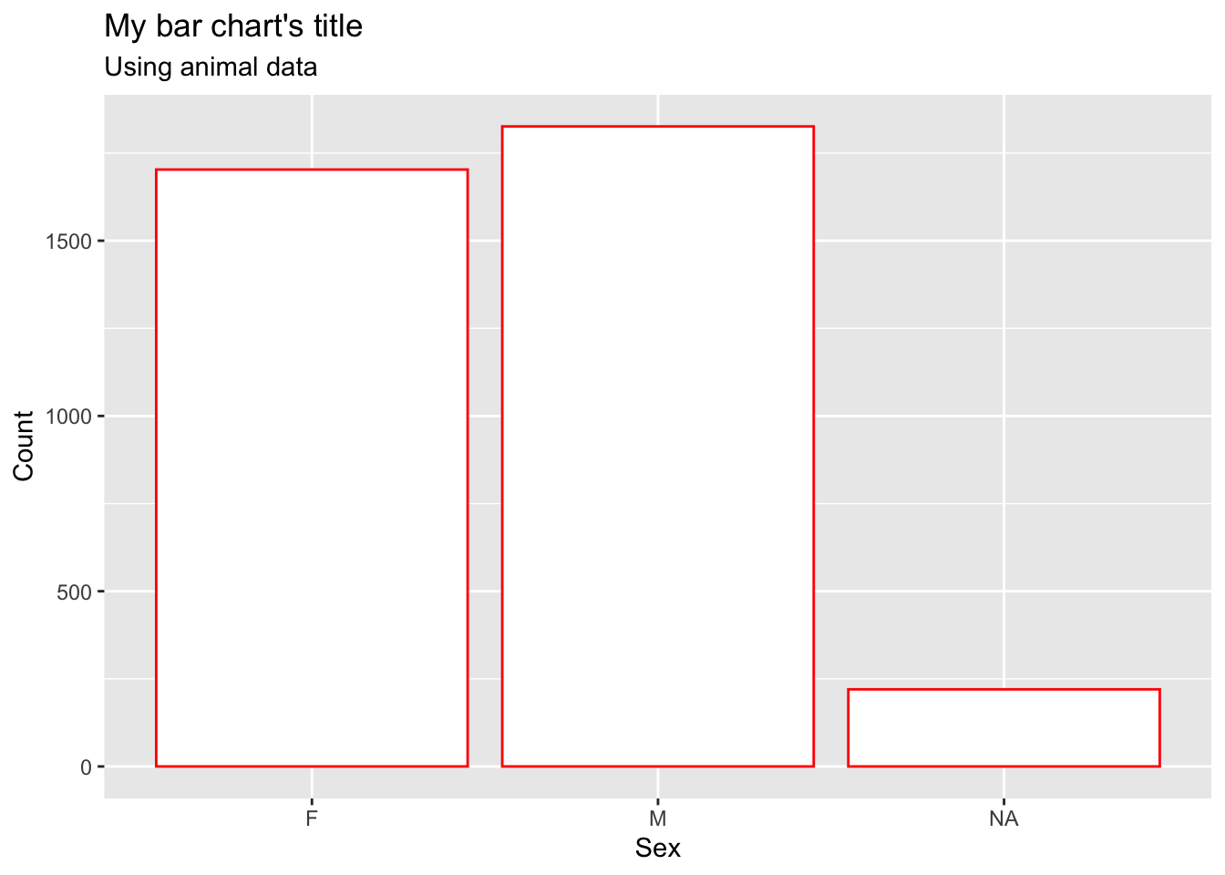
For the most part, you won’t really need to change the y-axis as it just gives the count, but make sure to change the x-axis if it is a confusing variable name.
75.5.3 Plotting numeric variables
You can still create bar charts using numeric variables, provided that there aren’t too many different numbers present.
animals %>%
  ggplot(aes(x = litter_size)) +
  geom_bar() +
  labs(title = "Distribution of Litter Sizes",
       x = "Litter Size")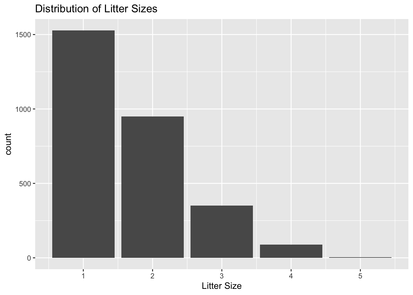
75.5.4 Rotating your bar chart
The coord_flip function works to rotate the bar chart, giving a different view of the data. It also helps display the labels on the x-axis if they are overlapped. For this example, we can rotate the graph that was plotted above.
animals %>%
  ggplot(aes(x = litter_size)) +
  geom_bar() +
  labs(title = "Distribution of Litter Sizes",
       x = "Litter Size") +
  coord_flip()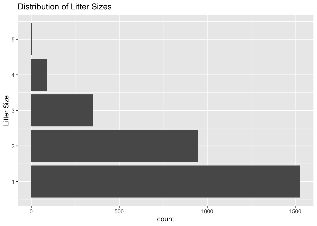
75.6 Exercises
75.6.1 Plot a Simple Bar Chart
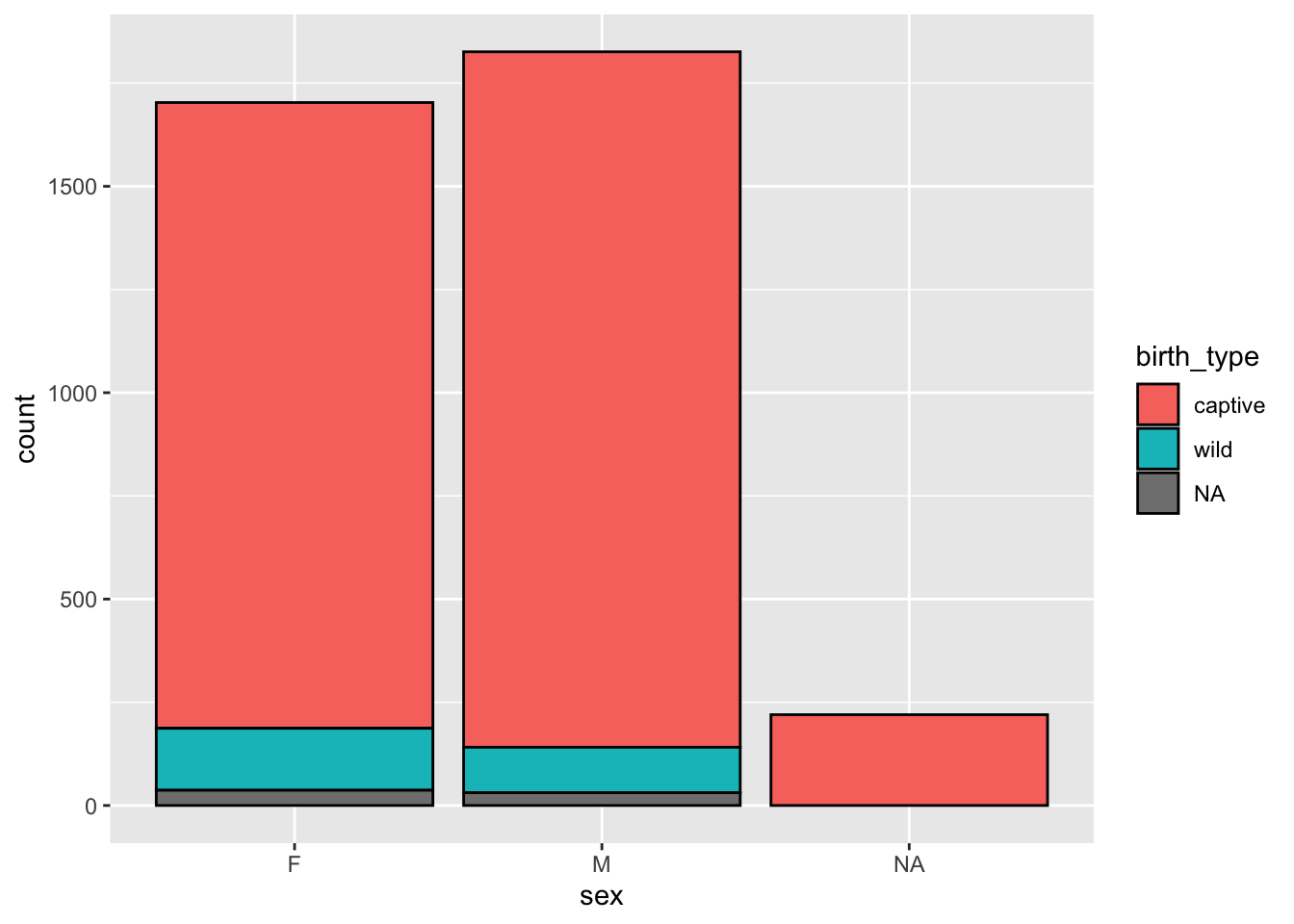
Create a bar chart of the type of birth for the lemurs in the animals dataset. (Hint: the variable for type of birth is birth_type)
# Enter code below
animals
#> # A tibble: 3,749 × 20
#>    animal_id studbook_id name   taxonomic_code species sex
#>    <chr>     <chr>       <chr>  <chr>          <chr>   <chr>
#>  1 0001      <NA>        White… OGG            Northe… F
#>  2 0002      <NA>        Bruis… OGG            Northe… M
#>  3 0003      <NA>        George OGG            Northe… M
#>  4 0004      <NA>        Tigger OGG            Northe… M
#>  5 0005      <NA>        Kanga  OGG            Northe… M
#>  6 0006      <NA>        Roo    OGG            Northe… F
#>  7 0007      <NA>        Hermit OGG            Northe… M
#>  8 0008      <NA>        Pigle… OGG            Northe… F
#>  9 0009      <NA>        Pooh … OGG            Northe… M
#> 10 0010      <NA>        Eeyore OGG            Northe… M
#> # … with 3,739 more rows, and 14 more variables:
#> #   birth_date <date>, birth_type <chr>, litter_size <dbl>,
#> #   death_date <date>, mother_id <chr>, mother_name <chr>,
#> #   mother_taxonomic_code <chr>, mother_species <chr>,
#> #   mother_birth_date <date>, father_id <chr>,
#> #   father_name <chr>, father_taxonomic_code <chr>,
#> #   father_species <chr>, father_birth_date <date>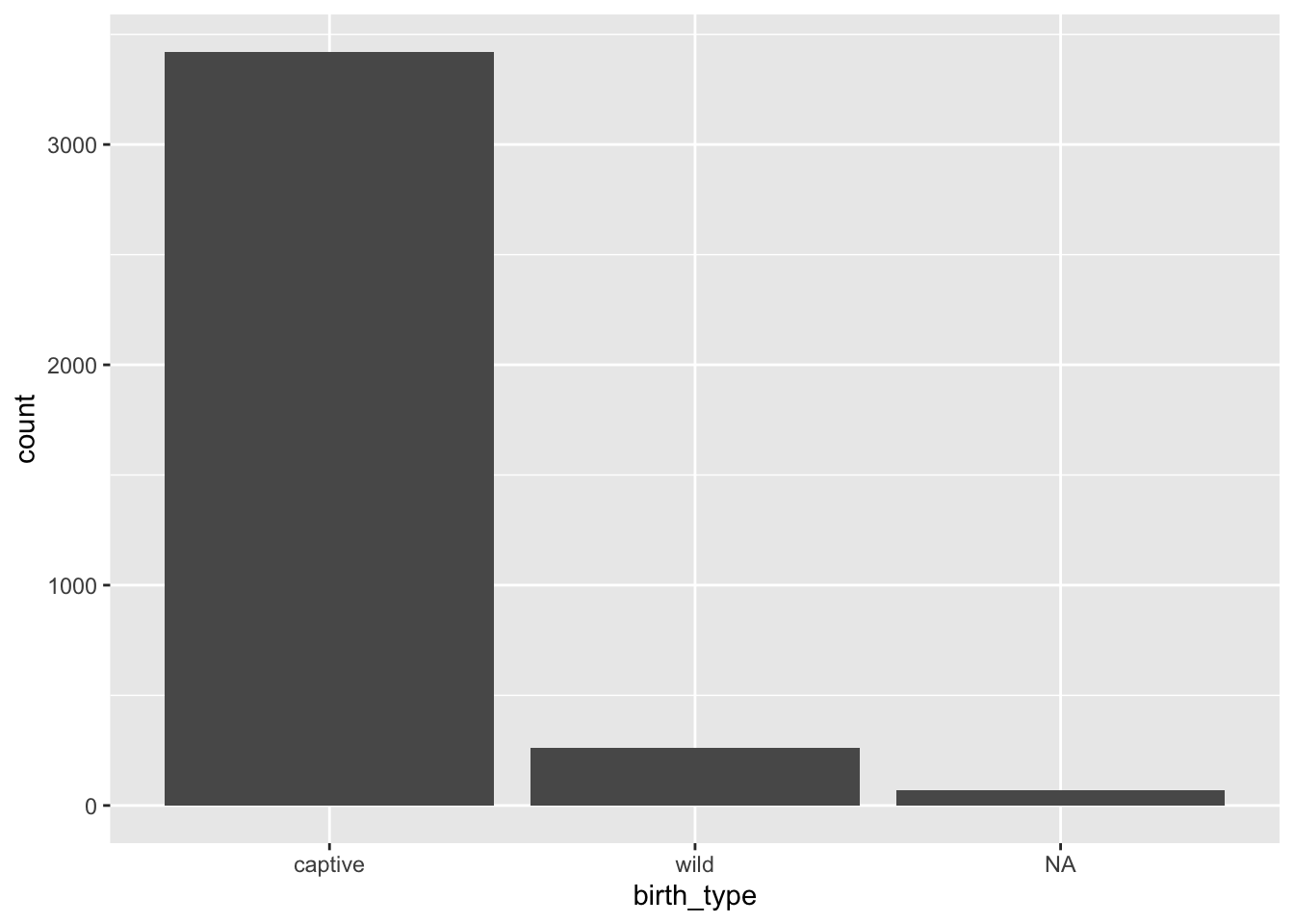
75.6.2 Making your bar chart a little more interesting
For this exercise, pick any colour to fill the bars of the bar chart and another colour for the outline. This time, plot the different types of species present in the dataset (don’t worry about the labels overlapping, we’ll address that later.)
# Enter code below, choose any colour you want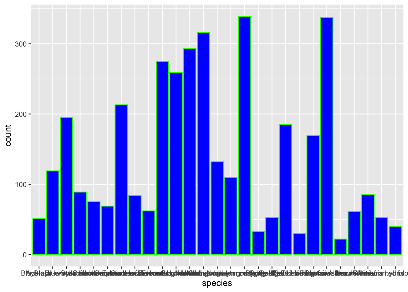
Since there were so many unique names in the species variable, it causes the x-axis labels to overlap. We can fix this using coord_flip, try it out for yourself! Plot the same graph as above, but use the coord_flip function
# Enter solution below
animals %>%
  ggplot(aes(x = species)) +
geom_bar(fill = "blue", colour = "green") +
coord_flip()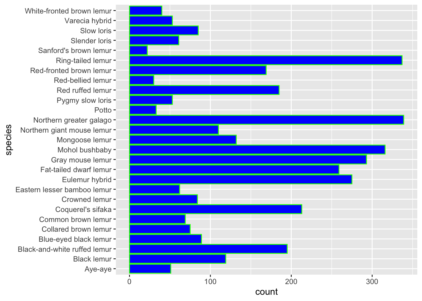
75.6.3 Using the aes() fill option
For this exercise, plot the distribution of species of Lemur present in the dataset. Then, fill each bar depending on the sex of the lemur.
animals %>%
  ggplot(aes(x = sex, fill = species)) +
  geom_bar() +
  coord_flip()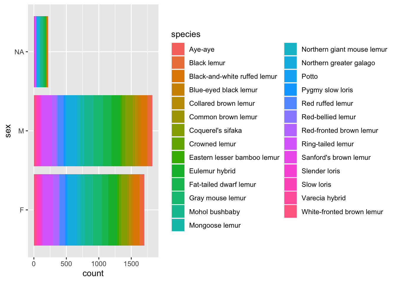
animals %>%
  ggplot(aes(x = species, fill = sex)) +
  geom_bar() +
  coord_flip()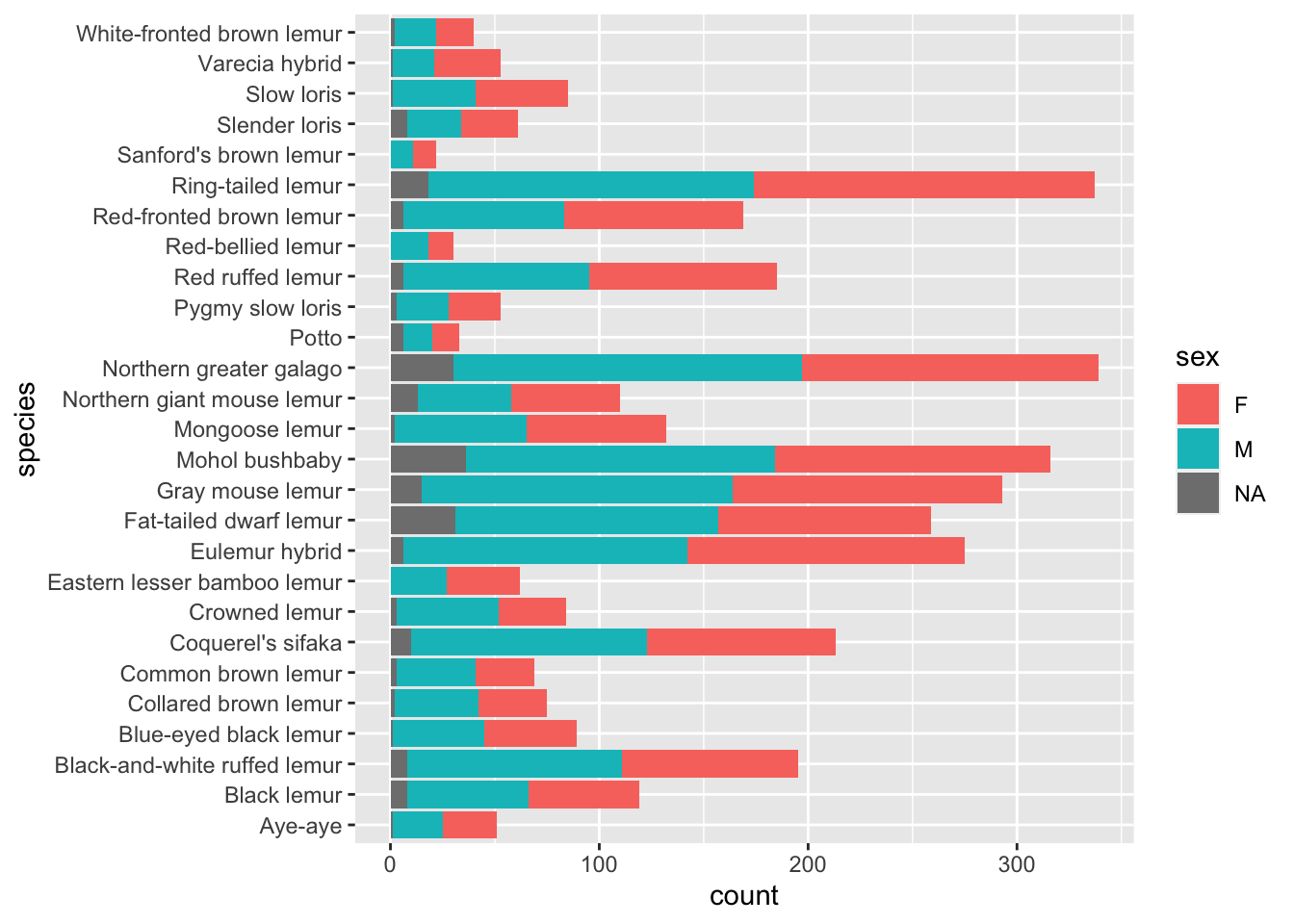
75.7 Common Mistakes & Errors
If the outline for graphs shows up but there are no bars present, it likely occurred because you didn’t add
geom_barto your expression.If your labels appear to overlap, you can try using
coord_flipto space them out a bit. If that doesn’t work, you can add thethemefunction and change the size, and angle of the text. For example,theme(axis.text.x = element_text(angle=90))puts the text at a 90 degree angle.When connecting
ggplottogeom_barmake sure you use a plus sign (+) instead of the pipe operator.If you get an error saying “object not found,” it means that you may have missed a quotation mark around a colour or made a typo when referencing a variable.
75.8 Next Steps
For more information on bar charts in R you can look at http://www.sthda.com/english/wiki/ggplot2-barplots-quick-start-guide-r-software-and-data-visualization
Another great resource for the different type of bar charts you can make in R is https://www.learnbyexample.org/r-bar-plot-ggplot2/