76 Various useful options
Written by Yena Joo and last updated on 7 October 2021.
76.1 Introduction
We learned how to create plots so far, now we are going to learn how to apply some additional functions to the graph to give them some changes. Visualization plays a very important role when using data analysis results.
In this lesson, you will learn how to:
- facet plots
- label plots
- change colors of the plots
- function
breaks_pretty()
Prerequisite skills include:
- You should be familiar with
ggplotnow.
- You also should be able to read and manipulate datasets.
Highlights:
- Everything about how to make plots prettier!!
76.2 Faceting
Faceting allows you to construct multi-panel plots and monitor how the scales of one panel compare to the scales of another. Which means, it partitions a plot into multiple panels. Each panel shows a different subset of the data.
In other words, it is sometimes necessary to create a graph for each group in data by splitting one plot into multiple plots. In this case, you can use the facet_wrap() and facet_grid() functions. These functions have the advantage of noticing the distribution of data by group easily.
There are two main functions for faceting :
-
facet_grid(): produces a 2d grid of panels defined by variables which form the rows and columns.
-
facet_wrap(): “wraps” a 1d ribbon of panels into 2d.
76.2.1 facet_grid()
facet_grid(x ~ y) will display x*y plots even if some plots are empty. This function defines the shape feature of the panel. When used with ggplot, the x-axis and y-axis are kept as they are, and displayed divided by the variables you specify inside the argument. For example, facet_grid(. ~ Variable) changes the plot vertically.
76.2.1.1 Arguments
facet_grid( rows = NULL, cols = NULL, scales = "fixed", space = "fixed", shrink = TRUE, labeller = "label_value", as.table = TRUE, switch = NULL, drop = TRUE, margins = FALSE, facets = NULL)- rows, cols: A set of variables quoted by
vars(). It can also be displayed(variable ~ variable). - scales: scales shared across all facets. (
"fixed","free_x","free_y","free").
For more information, click here.
Facet with one variable
Here, I am using a dataset that contains the information of members who climbed the mountain Himalaya. Let’s say, I would like to see the distribution of the sex of the members.
members <- readr::read_csv('https://raw.githubusercontent.com/rfordatascience/tidytuesday/master/data/2020/2020-09-22/members.csv')
hist_p <- members %>% ggplot(aes(age)) + geom_histogram(fill = "light blue", bins = 10)

# Split in vertical direction
hist_p + facet_grid(sex ~ .)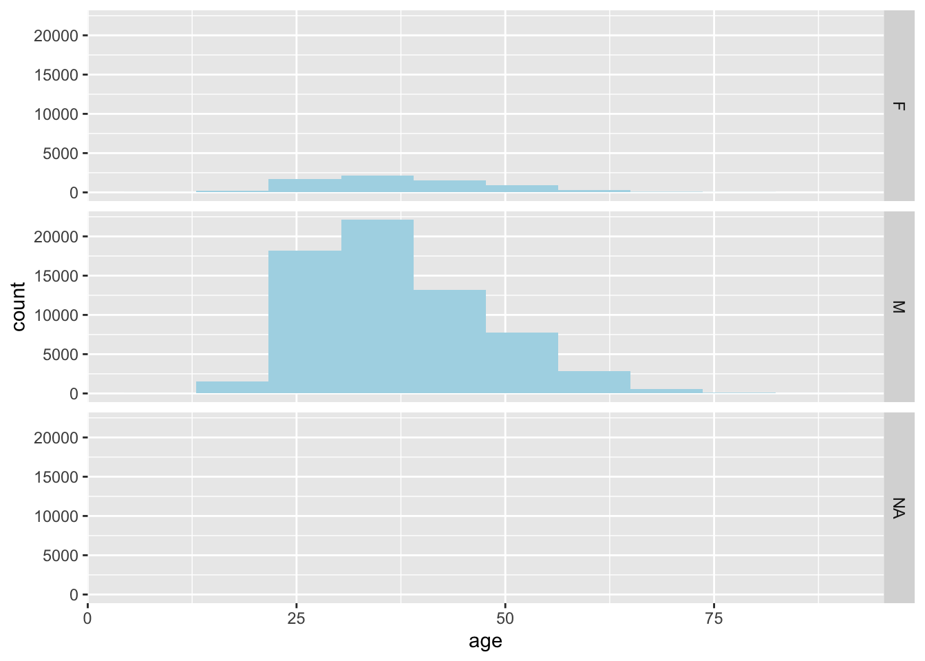
# Split in horizontal direction
hist_p + facet_grid(. ~ sex)
Splitting in vertical direction can be done with putting whichever variable you want to facet on the left, facet_grid(variable ~ .). Putting the variable on the right side would split horizontally.
Facet with two variables
You can also facet with two variables. Here, I will facet with variables success and injured. Since they are both type boolean, it would be better to label the categories using labeller = label_both.
hist_p + facet_grid(success ~ injured, labeller=label_both)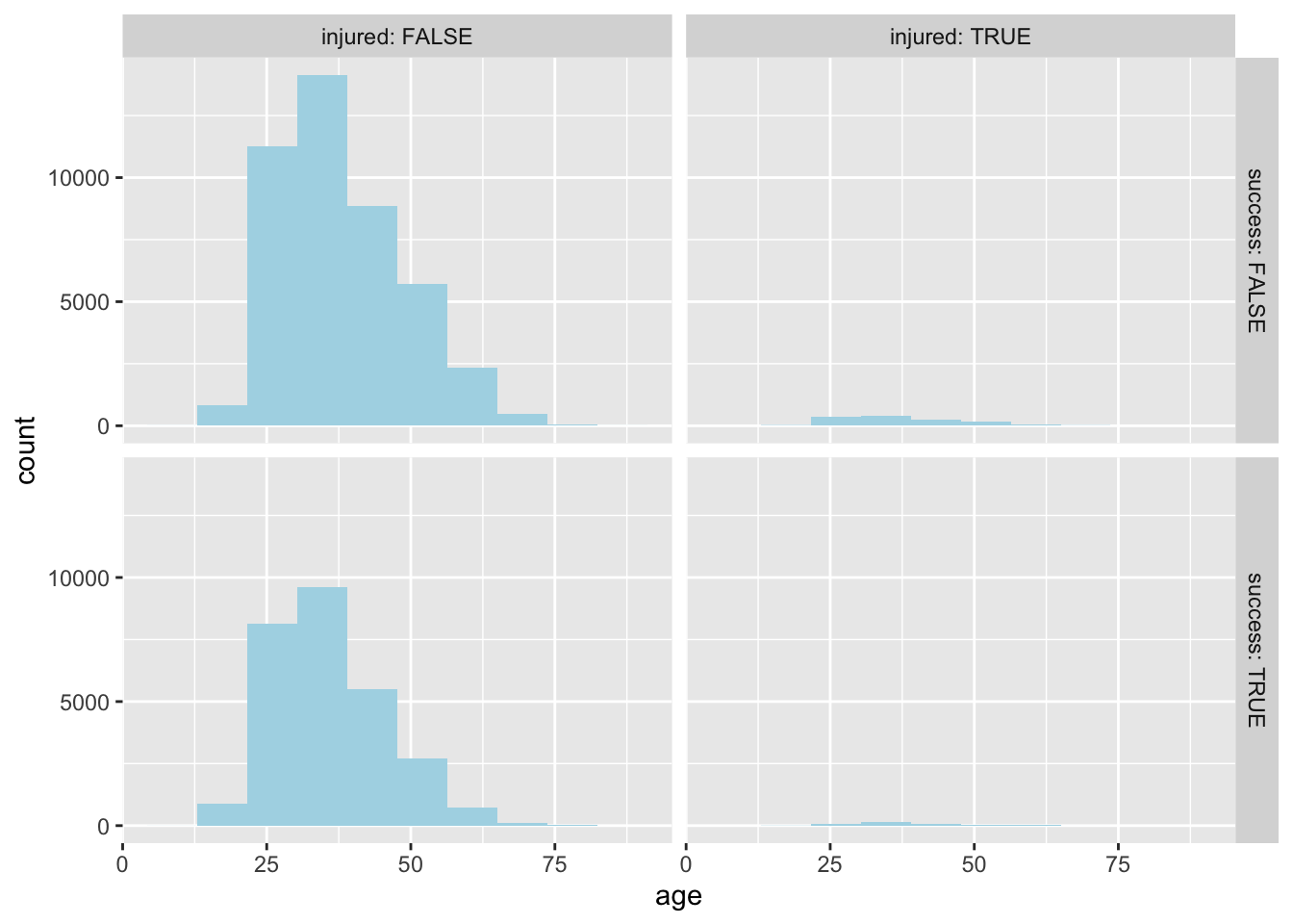
76.2.2 facet_wrap()
facet_wrap() wraps a 1d sequence of panels into 2d. It is easy to understand by comparing the distribution of data by group(category).
This function partitions the plot based on a categorical variable, and according to the factor of this column, the plot for each group is divided into subplots.
76.2.2.1 Arguments
facet_wrap(facets, nrow = NULL, ncol = NULL, scales = "fixed", shrink = TRUE, labeller = "label_value", as.table = TRUE, switch = NULL, drop = TRUE, dir = "h", strip.position = "top") - facets: set of variables. defines faceting groups on the rows or columns dimension.
- nrow, ncol: Number of rows and columns.
- scales: Specifies whether the x-axis and y-axis of each subplot are fixed.
Note that the column, which is passed to this function, must be a factor, discrete variable.
Here is an additional information on the arguments and examples you may find helpful.
Facets can be placed side by side using the function facet_wrap() as follows:
hist_p + facet_wrap(~ sex, nrow = 3, ncol=3)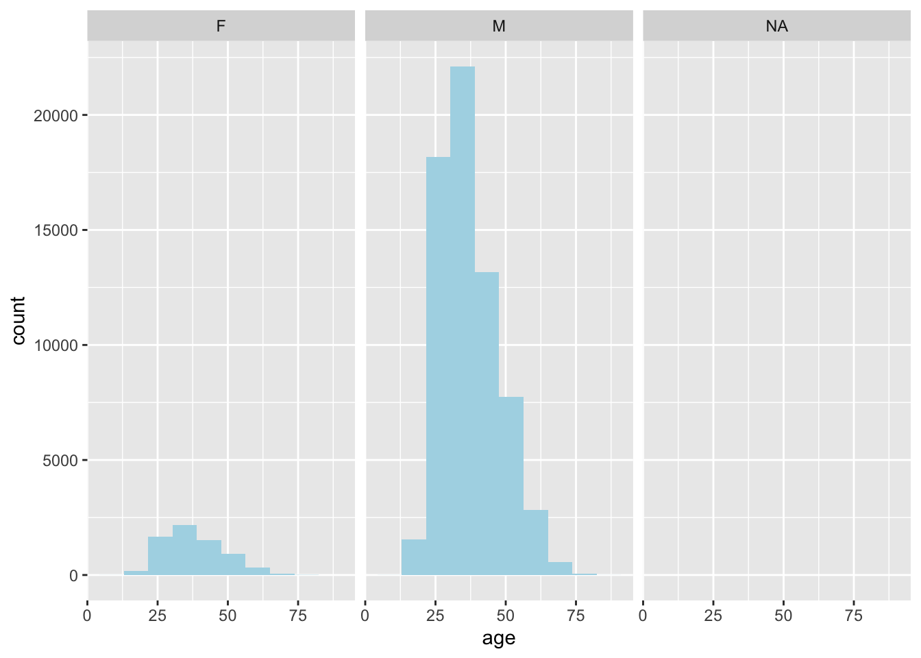
facet_wrap(x ~ y)displays only the plots having actual values. The function displays plots for every combination of the selected variables.
However, so far we don’t see much of a difference between facet_grid() and facet_wrap(), since the selected data is simple. Let’s try to use a rather complex plot to see the difference between the two functions.
76.2.3 facet_grid() vs facet_wrap()
We will use a built-in dataset mpg. First, create a scatter plot with variables hwy and displ. Then, I will use the variable manufacturer to facet the plot, using both facet_grid() and facet_wrap().
p <- ggplot(data = mpg, aes(hwy, displ)) + geom_point()
p + facet_wrap(vars(manufacturer))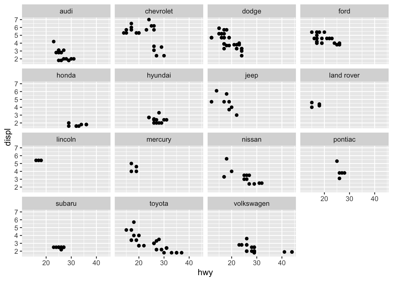
p + facet_grid(vars(manufacturer))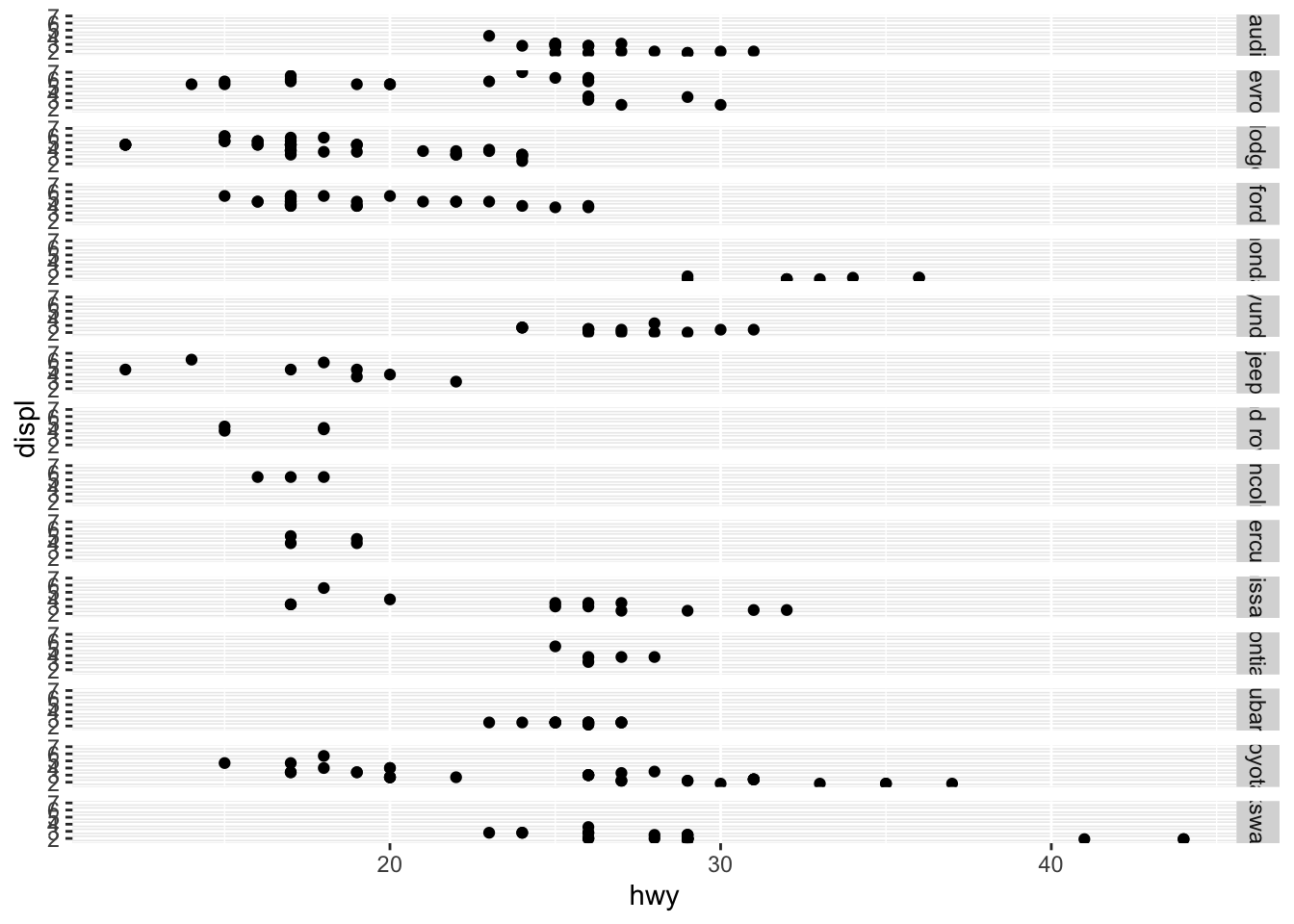
Now you can clearly see the difference between the two functions with the default arguments.
76.3 Labelling ggplot
ggplots can be labeled using labs()as follow:
japanese_blooming <- read.csv("https://raw.githubusercontent.com/tacookson/data/master/sakura-flowering/temperatures-modern.csv")
japanese_blooming %>%
  ggplot(aes(mean_temp_c)) + geom_histogram(fill = "pink", bins = 20) +
  labs(title = "This is a title",
  subtitle = "This is a subtitle",
  caption = "This is a caption",
  tag = "This is a tag",
  x = "This is a x-axis label",
  y= "This is an y-axis label")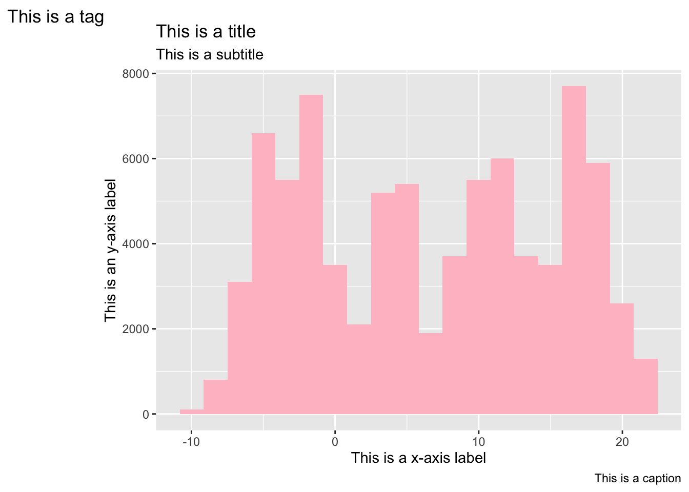
76.3.1 Arguments for labs()
- title: The text for the title.
- subtitle: The text for the subtitle for the plot which will be displayed below the title.
- caption: The text for the caption which will be displayed in the bottom-right of the plot by default.
- tag: The text for the tag label which will be displayed at the top-left of the plot by default.
- label: The title of the respective axis (for xlab() or ylab()) or of the plot (for ggtitle()).
- x: x-axis label
- y: y-axis label
76.3.2 Labeling without using labs()
-
xlab()andylab()adds the x-axis and y-axis labels.
-
ggtitle("title", subtitle = "subtitle")adds a title and a subtitle.
japanese_blooming %>%
  ggplot(aes(mean_temp_c)) + geom_histogram(fill = "pink", bins = 20) +
  xlab("another way to add x-axis label") +
  ylab("another way to add y-axis label") +
  ggtitle("Another way to add a title", subtitle = "Another way to add a subtitle")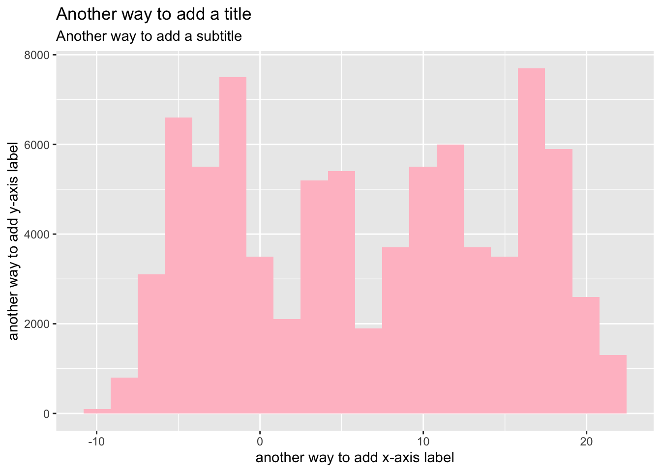
76.4 How to change colors of ggplot
76.4.1 Change to a single color
For plots such as boxplots and histogram, you can choose what color you want to “fill” and what color you want as an outline of the graph. When making ggplots, you just add geom_PLOTTYPE(fill = "color", color = "color").
# box plot
ggplot(mtcars, aes(group=vs, y=wt)) +
  geom_boxplot(fill='pink', color="red")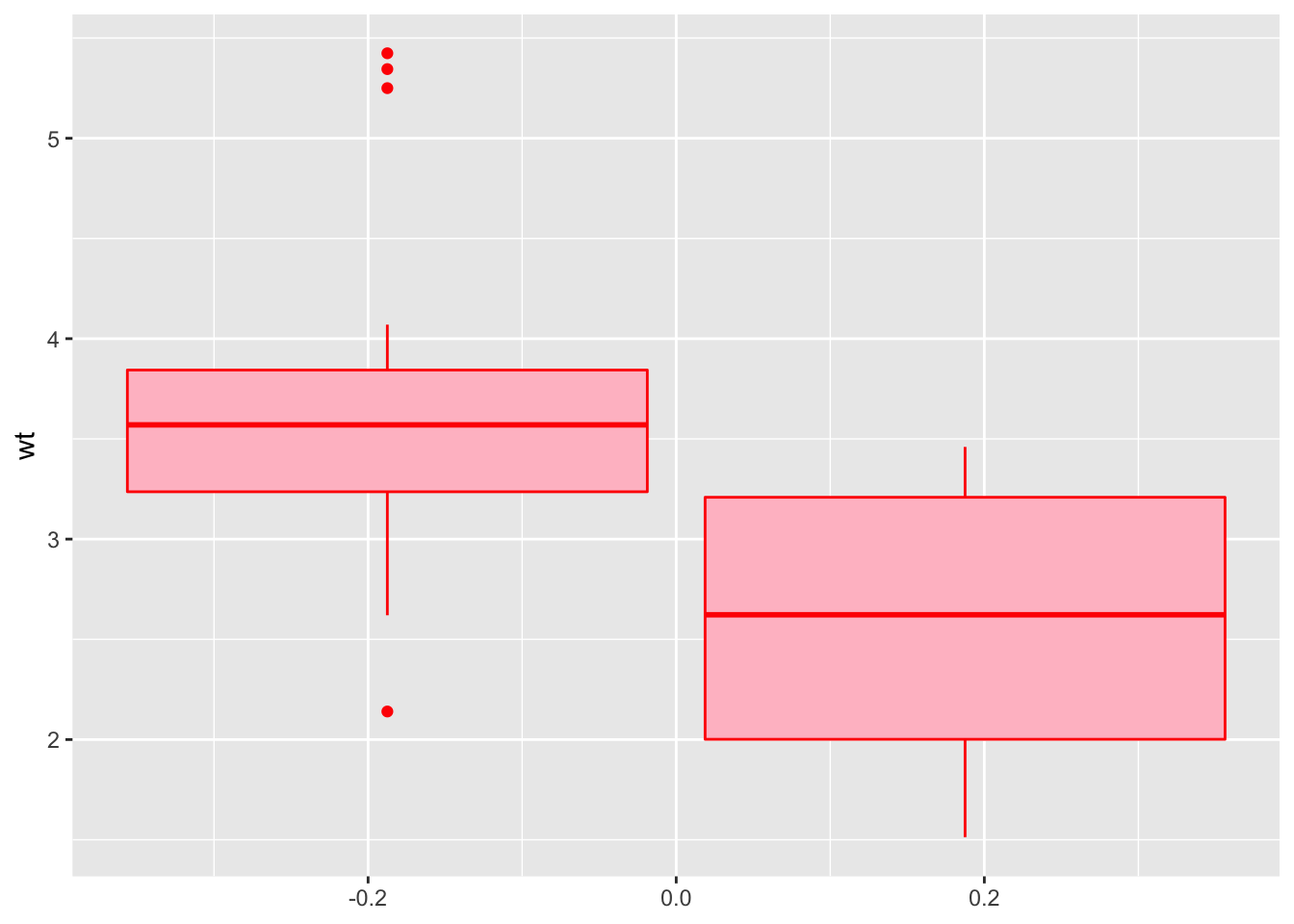
# scatter plot
ggplot(mtcars, aes(x=wt, y=mpg)) +
  geom_point(color="dark red")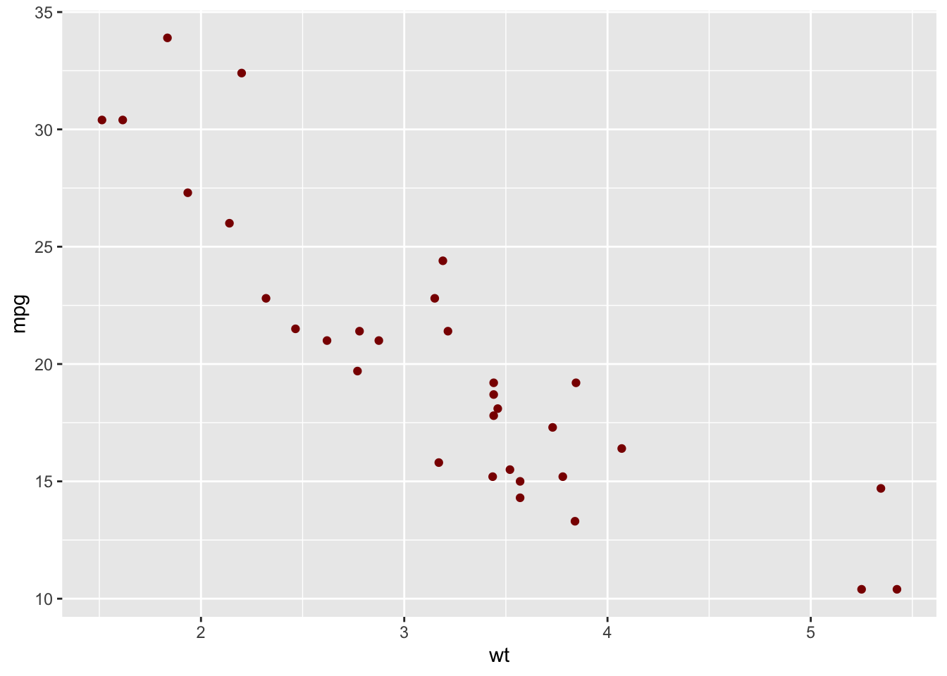
76.4.2 Change color by groups
Also, you can set the color by groups of variable. It automatically sets up a legend of changing colors depending on the variable value, using fill or color = VARIABLE NAME.
# Box plot
ggplot(mtcars, aes(group = vs, y = wt, fill = vs)) +
  geom_boxplot()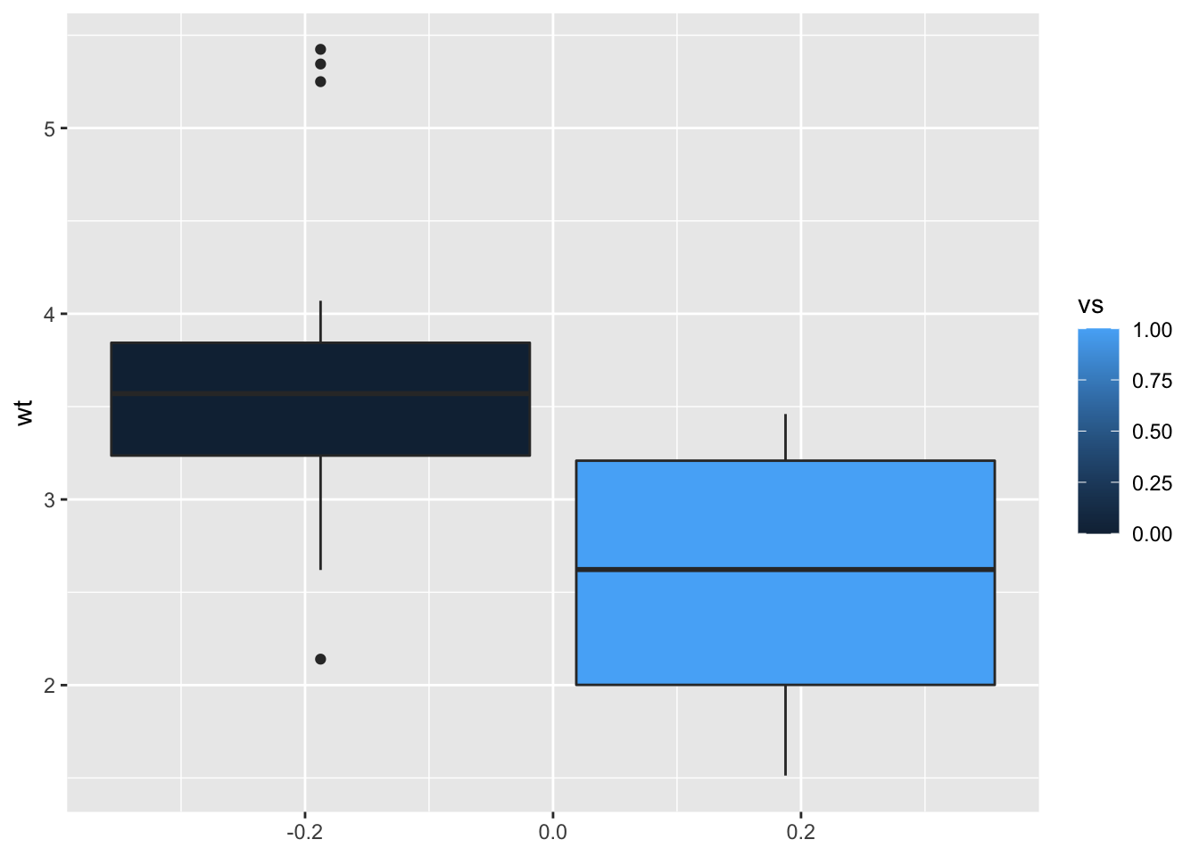
# Scatter plot
ggplot(mtcars, aes(x = wt, y = mpg, color = mpg)) + geom_point()
76.4.3 basic theme changing
theme_gray : gray background color and white grid linestheme_bw : white background and gray grid linestheme_linedraw : black lines around the plottheme_dark(): Dark background designed to make colours pop out
Note that, the function theme_set() changes the theme for the entire session.
(The detailed information of the basic theme changing can be found here
76.5 pretty_breaks() or breaks_pretty()
breaks_pretty() uses default R break algorithm as implemented in pretty(). This is used often for splitting date/times. For example, when you want to divide 24 hours into 10 blocks, you would use the function breaks_pretty to split the time.
pretty_breaks(n = 5, ...)
breaks_pretty()
Important argument:
- n: desired number of breaks
-
other arguments passed on
pretty
Here is an example of using the function:
Inside the parameter, you put the desired number of breaks. However, you may get slightly more or less breaks than what you put. For example, I can request to break number from 1 to 10 into 5 parts.
a <- breaks_pretty(n = 5)(1:10)
a
#> [1]  0  2  4  6  8 10
Then it returns 6 parts, which is slightly more than what I requested in the argument.
Another example is to break dates into multiple parts using as.Date().
b <- pretty_breaks(n = 12)(as.Date(c("2020-01-01", "2021-01-01")))
b
#>     Jan 2020     Feb 2020     Mar 2020     Apr 2020
#> "2020-01-01" "2020-02-01" "2020-03-01" "2020-04-01"
#>     May 2020     Jun 2020     Jul 2020     Aug 2020
#> "2020-05-01" "2020-06-01" "2020-07-01" "2020-08-01"
#>     Sep 2020     Oct 2020     Nov 2020     Dec 2020
#> "2020-09-01" "2020-10-01" "2020-11-01" "2020-12-01"
#>     Jan 2021
#> "2021-01-01"
This would automatically return the broken down scale of the date for you.
These are the basics of the function breaks_pretty() or pretty_breaks() (they are interchangeable). If you would like to learn more about how to use these scales in a graph and visualize them, the information could be found here
76.6 Exercises
76.6.1 Question 1
using facet_grid(), divide the plot below by variable vs.
mtcars %>% ggplot(aes(y = mpg, x = cyl)) + geom_point()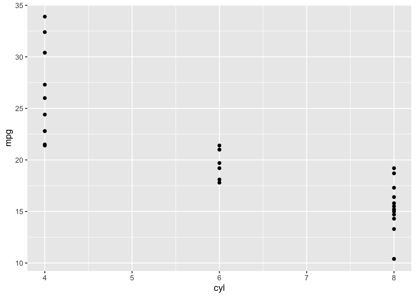
plot <- mtcars %>% ggplot(aes(y = mpg, x = cyl)) + geom_point()
plot + facet_grid(vs ~ .)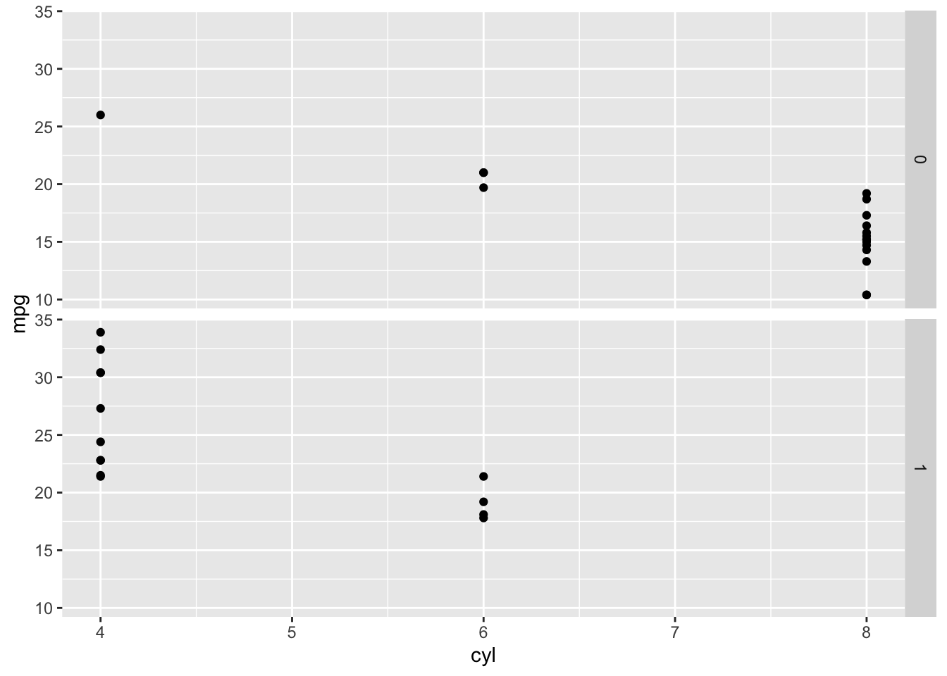
76.6.2 Question 2
Label the following graph. Title should be ‘scatter plot of mtcars,’ x-axis should be ‘wt’ and y-axis should be ‘mpg.’
ggplot(mtcars, aes(x = wt, y = mpg, color = mpg)) + geom_point()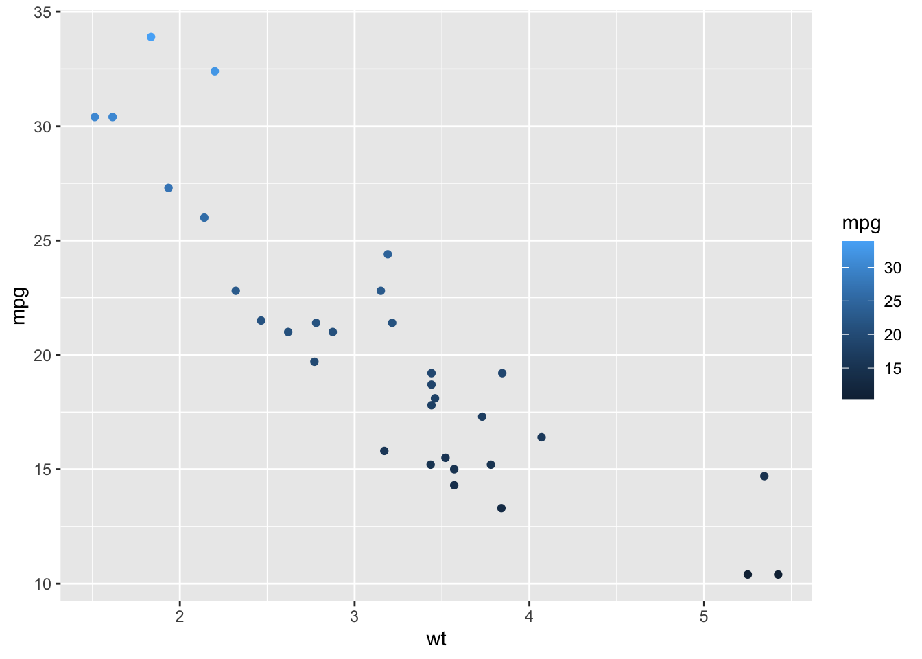
ggplot(mtcars, aes(x = wt, y = mpg, color = mpg)) + geom_point()
76.6.3 Question 3
Change the color of the scatter plot to ‘pink.’
ggplot(data = mtcars, aes(x = wt, y = mpg)) +
  geom_point()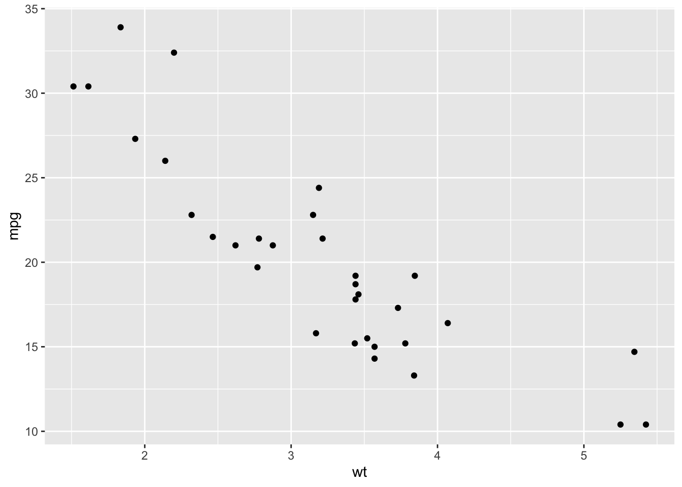
ggplot(data = mtcars, aes(x = wt, y = mpg)) +
  geom_point(color = 'pink')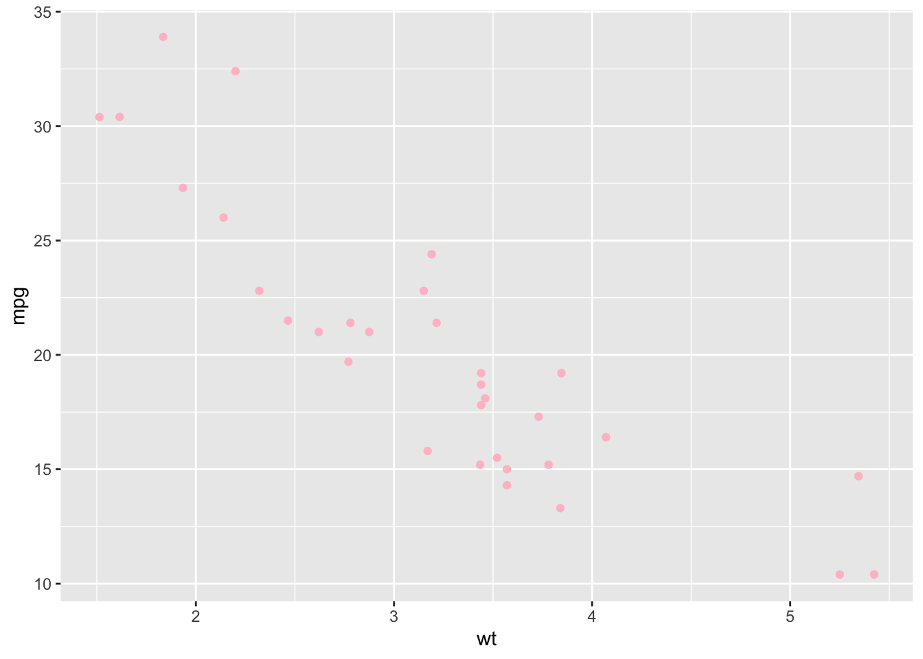
76.7 Next Steps
Good visualizations can help the audience/readers remember the information or the message the plot contains. Try to make plots using useful options to make the graph readable & attractive.