86 Exercise 4
Use the faithfuld data set in R to plot waiting vs eruptions and add a layer of rectangles(to create a heat map) using the most high performing function(out of the three that we covered). Add density as the fill aesthetic and smooth out the graph.
ggplot(faithfuld, aes(waiting, eruptions)) +
geom_raster(aes(fill = density), interpolate = TRUE) 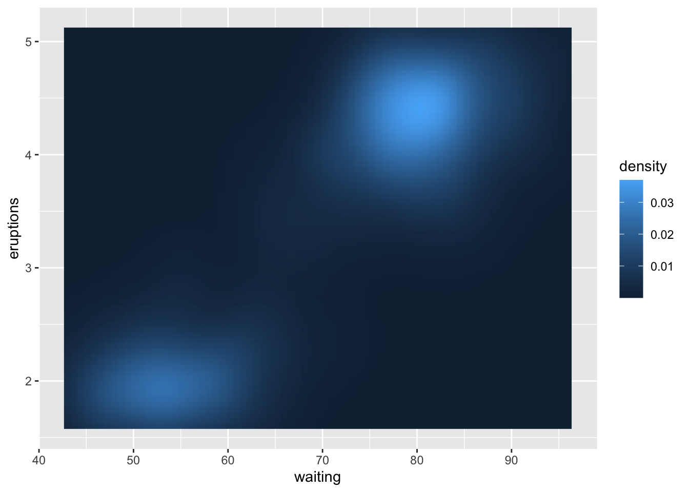
86.1 Common mistakes and errors
- When dealing with violin plots you may get a warning such as “Warning: Removed 3 rows containing missing values (geom_segment).” This is due to the way ggplot2 deals with out of range axes and can be fixed using the ylim or xlim functions.
- When working with ggplot, I occasionally find myself using the pipe operator(%>%) instead of using pipe instead of the plus (+). This might seem like a small mistake but I have often spent a lot of time staring at my code wondering why it isn’t working before realizing I was using the wrong operator.
- If you are every stuck wondering why the properties you added for the graph are not working, ensure you have added them inside the plot layer and not the ggplot layer.
86.2 Next steps
- To learn more about violin plots, this page is very useful- https://mode.com/blog/violin-plot-examples/
- You can look into other related functions like: geom_path(), stat_density(), stat_yd
- To understand and work with map data in detail, this is a useful resource- https://ggplot2-book.org/maps.html
- You can explore other interesting geoms listed here: https://ggplot2.tidyverse.org/reference/
86.3 References
- [r documentation] :
geom_path() - https://ggplot2.tidyverse.org/reference/geom_path.html
geom_polygon() - https://ggplot2.tidyverse.org/reference/geom_polygon.html
geom_raster(), geom_rect(), and geom_tile() - https://ggplot2.tidyverse.org/reference/geom_tile.html
geom_violin() - https://ggplot2.tidyverse.org/reference/geom_violin.html?q=violin
map_data()- https://www.rdocumentation.org/packages/ggplot2/versions/3.3.5/topics/map_data
86.4 Exercises
86.4.1 Question 1
- Which plot would you use to get the representation of the distribution of a numeric variable (pick all that apply)?
- Bar Plot
- Box Plot
- Violin Plot
- Density Plot
86.4.2 Question 2
- The Violin plot is a mixture of which plots (pick all that apply)?
- Scatter Plot
- Box Plot
- Histogram
- Density Plot
86.4.3 Question 3
- Which aesthetic determines which cases are connected together into a polygon (pick one)?
- Group
- Subgroup
- Alpha
- Fill
86.4.4 Question 4
- Which function is preferred when tiles are of the same size because it is the fastest (pick one)?
86.4.5 Question 5
- Which plot will you use if you have three goals- you want to observe the distribution of numeric data, compare distributions between multiple groups and want to show the summary statistics (pick one)?
- Bar Plot
- Box Plot
- Violin Plot
- Scatter Plot
86.4.6 Question 6
- Which of these is not a parameter for
geom_tile()(pick as many as apply)?- x
- y
- xmin
- ymin
86.4.8 Question 8
- True or False: We need 4 data frames to construct a polygon using
geom_polygon().- True
- False
86.4.9 Question 9
- True or False: Polygons in R are just a variation of paths created by
geom_path().- True
- False