74 Histograms
Written by Haoluan Chen and last updated on 7 October 2021.
74.1 Introduction

Image Source:https://github.com/allisonhorst/stats-illustrations/blob/master/rstats-artwork/ggplot2_exploratory.png, Allison Horst
In this lesson, you will learn how to:
Create a histogram in R using ggplot2 package
Customize your histogram
Prerequisite skills include:
Highlights:
- Create a histogram with a real dataset
74.2 Making and customizing histograms
74.2.1 What is a histogram?
A histogram is a visual representation of the distribution of numerical data. It allows you to easily see where your data is concentrated and the variation of the data. It can help visually answer questions like:
- what values in the dataset appear most often?
- what is the range of values found in my data?
Here, we have a book dataset from Alex Cookson. This dataset contains 9,000 children’s books that have been rated from 1-5 stars.
books <- read_tsv("https://raw.githubusercontent.com/tacookson/data/master/childrens-book-ratings/childrens-books.txt")
#> Rows: 9240 Columns: 15
#> ── Column specification ────────────────────────────────────
#> Delimiter: "\t"
#> chr  (5): isbn, title, author, cover, publisher
#> dbl (10): pages, original_publish_year, publish_year, ra...
#>
#> ℹ Use `spec()` to retrieve the full column specification for this data.
#> ℹ Specify the column types or set `show_col_types = FALSE` to quiet this message.
We can see that rating is a numerical variable, so we can create a histogram to visualize the rating distribution.
Using the following code, we can create our first and simplest histogram in R!
books %>%
  ggplot(aes(rating)) +
  geom_histogram()
#> `stat_bin()` using `bins = 30`. Pick better value with
#> `binwidth`.
#> Warning: Removed 37 rows containing non-finite values
#> (stat_bin).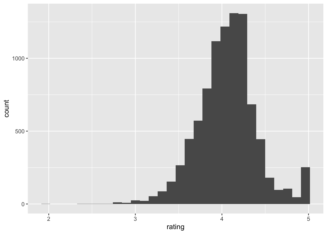
For the histogram it only requires one numeric variable as input (rating in this case). The function geom_histogram() automatically counts the number of numerical values that lie within specific ranges, called bins. Bins are defined by their lower bounds (inclusive); the upper bound is the lower bound of the next bin.
Looking at the histogram above, we can see that the x-axis (rating) is divided into small blocks (bins) and the y-axis represents the number if observations lie within that block. The warning is telling you there is missing values in the rating. We can ignore this for now.
74.2.2 Other Optional Arguments
In the geom_histogram function, we can adjust our bins’ size, titles of the histogram, and color of our histogram.
74.2.2.1 Bin size
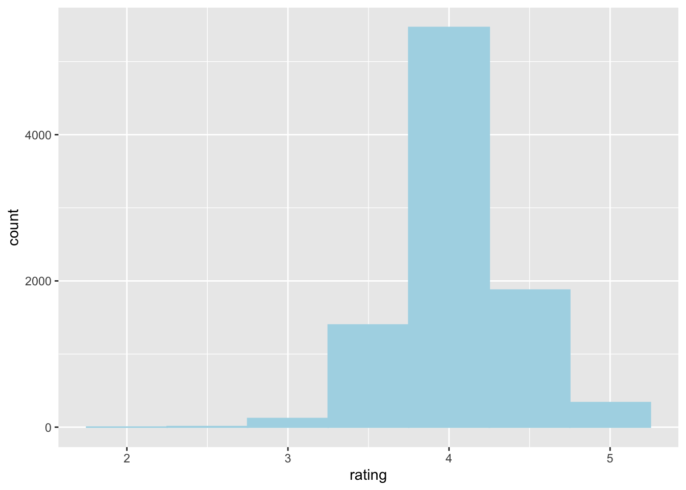
We can adjust the bin size of our histogram by setting the optional parameter binwidth.
books %>%
  ggplot(aes(rating)) +
  geom_histogram(binwidth = 1)
#> Warning: Removed 37 rows containing non-finite values
#> (stat_bin).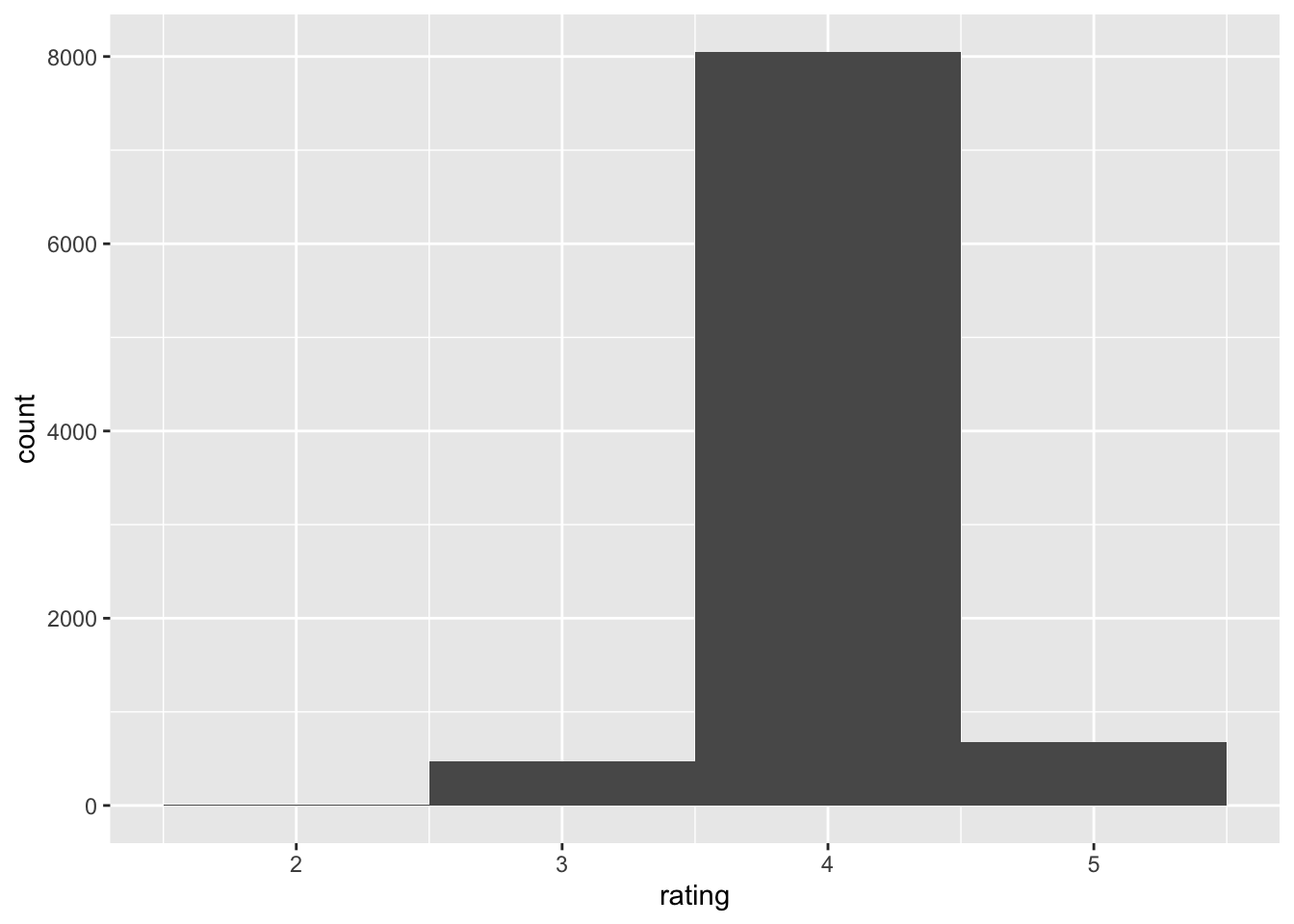
Here, I am setting the bin width equal to 1. This means that we divide the rating into bins of range 1. In this case, we have a bin with range [2.5,3.5), [3.5,4.5), and [4.5,5.5). Then, we count the number of ratings that lies within this range. From the above histogram, we can see that there is about 8000 books lies within the range of [3,4).
Without specifying the binwidth, geom_histogram will automatically find an optimal binwidth.
74.2.2.2 Color and fill
books %>%
  ggplot(aes(rating)) +
  geom_histogram(color ="red", fill = "light blue")
#> `stat_bin()` using `bins = 30`. Pick better value with
#> `binwidth`.
#> Warning: Removed 37 rows containing non-finite values
#> (stat_bin).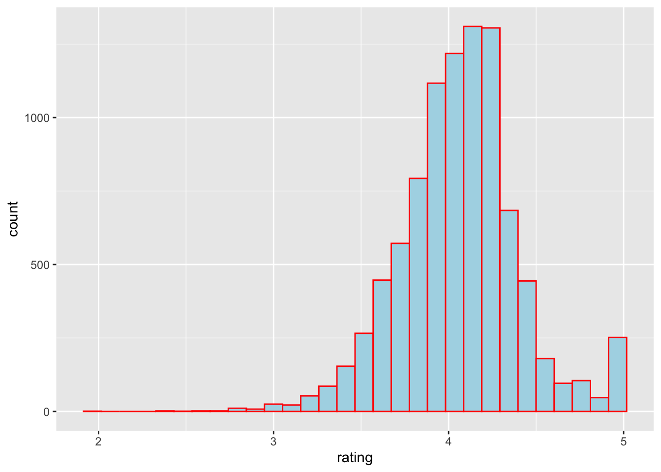
The color parameter specify the color of the boundary of each bin and the fill parameter specify the color of the bin. You can create change the color of your histogram to make more unique and appealing.
74.2.2.3 Title, and name of the axes
Using the labs() function in ggplot2 we can change the title and the name of the axes.
books %>%
  ggplot(aes(rating)) +
  geom_histogram(color ="red", fill = "light blue") +
  labs(title = "A historgram of children's book rating",
       x = "Book rating", y = "Number of books")
#> `stat_bin()` using `bins = 30`. Pick better value with
#> `binwidth`.
#> Warning: Removed 37 rows containing non-finite values
#> (stat_bin).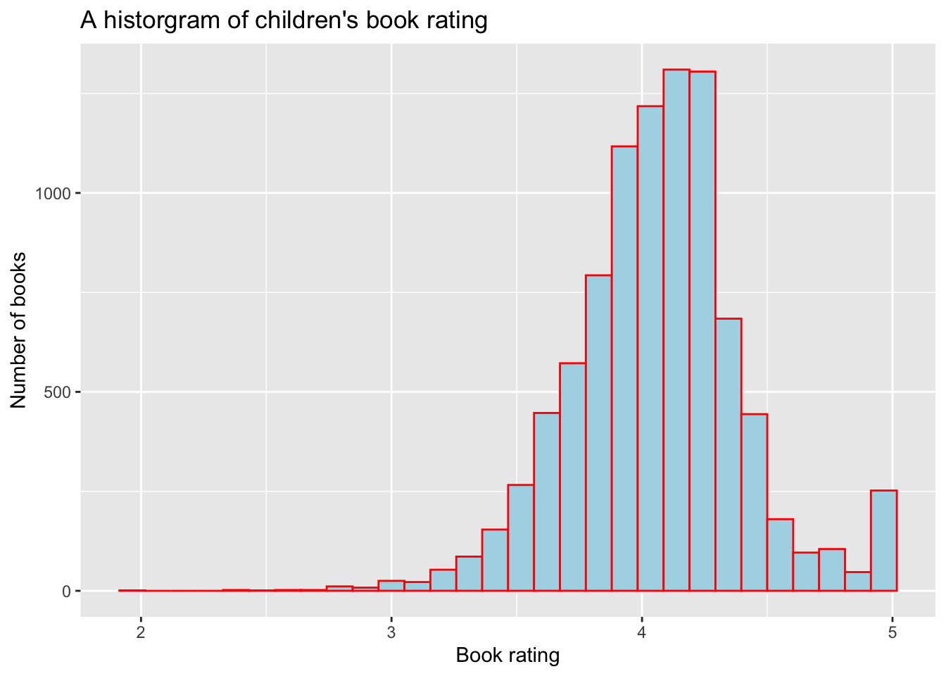
In the labs() function, title specifies the title of your plot, x specifies the name of the x-axis and y specifies the name of the y-axis.
74.3 Exercises
74.3.1 Exercise 1
Please create a histogram for the ratings of the books that are published in 2010
Hint: filter() in dplyr package maybe helpful
74.3.3 Exercise 3
Please change the colour and the fill of your histogram in Exercise 1 You can choose any colour you like from this website: https://www.rapidtables.com/web/color/RGB_Color.html You may use the colour name or the Hex code provided in the website.
74.4 Common Mistakes & Errors
- Make sure your input variable is a numeric variable.
- Make sure you are using
+to connect theggplot()andgeom_histogram(), not the pipe operator%>% - Check you have closed all the bracket
74.5 Next Steps
For next step, you can customize your histogram with different colour, labels and change the line types. You can find examples in this website: http://www.sthda.com/english/wiki/ggplot2-histogram-plot-quick-start-guide-r-software-and-data-visualization
In this website https://www.r-graph-gallery.com/histogram.html, you can find different types of histogram you can make in R it has codes that you can follow along. On the main page, there are many other types of visual representations you can build in R, such as box plot and scatter plot:https://www.r-graph-gallery.com/index.html
74.6 Exercises
74.6.1 Question 1
A histogram is a visual representation of the distribution of numerical data. a. True b. False
74.6.3 Question 3
binwidth is a required parameter for geom_histogram()
a. True
b. False
74.6.4 Question 4
How do you add title in your plot?
a. Use labs()
b. add a title parameter in geom_histogram()
c. add a labs parameter in geom_histogram()
d. add a title parameter in ggplot()
74.6.5 Question 5
You should always use a larger binwidth when you create a histogram. a. True b. False
74.6.6 Question 6
What can you do to customize your histogram? (multiple answer) a. Change color of your histogram b. Change binwidth of your histogram c. Change the shape of your histogram d. All of the Above
74.6.7 Question 7
books %>% ggplot(aes(rating)) + geom_histogram(color =“red”)
What does the code produce? a. A basic histogram b. A red histogram c. A red histogram with red fill color d. A histogram with boundary of each bin in red
74.6.8 Question 8
How do you change the binwidth of your histogram?
a. You cannot change your binwidth
b. add a binwidth parameter in geom_histogram()
c. add a binwidth parameter in ggplot()
d. None of the above