6 Hello World, again!
Written by Shirley Deng and last updated on 7 October 2021.
6.1 Introduction
In our second scenario, let’s assume we’ve been diligently following social distancing guidelines and staying home amid the pandemic. It’s rough not being able to go out and grab food with friends and family, but we make do. As a result, we’ve been using the SuperNoms app more than usual… but how \(much\) more? All the promo codes SuperNoms has been providing recently make for great incentives to order more takeout.
The Identispot music streaming service provides an analysis of users’ listening habits at the end of every year, Identispot Unwrapped. We take inspiration from Identispot Unwrapped and track our SuperNoms orders for the month of January. We want to get a feel for our favourite restaurants, our favourite cuisine categories, and see if there are any patterns in our ordering habits - all things we can plot and graph visually.
6.2 Data
Based on our goal, it seems natural that we’d want to take note of our orders’ restaurants, cuisine categories, and total cost. With consideration of all the new promotions on the SuperNoms app, we also take note of any discounts applied.
For those unfamiliar with the SuperNoms app, each order can only be made from a single restaurant. Each restaurant is categorized under one style of cuisine, such as Fast Food, Indian, Pizza, or Desserts. Additionally, promotions offered on the app are % discounts ranging from 10 to 40% off.
We store this information in a dataframe called orders, with variables (columns) restaurant, order_total, promo_percent, and category for the information we’re keeping track of.
set.seed(334)
sample_size <- 9
order_total <- round(runif(n=sample_size, min=15, max=65), digits=2)
promo_percent <- sample(c(0, 10, 15, 20, 25, 30, 40), size=sample_size, replace=TRUE)
category <- sample(c("Fast Food", "Indian", "Pizza", "Burgers", "Middle Eastern",
                     "Desserts", "American", "Wings", "Bubble Tea", "Caribbean",
                     "Portuguese", "Filipino", "Cantonese", "Tacos", "Pasta"),
                   size=sample_size, replace=TRUE)
orders <- tibble(order_total, promo_percent, category)
restaurant <- c("Mystical Noodle", "Wings R Wild", "Mystical Noodle",
                 "Splenda Marmalade", "Slice of Flames", "Rando's",
                 "Guajillo", "SharingTea", "Zotto Zotto")
orders <- tibble(restaurant, orders)
orders
#> # A tibble: 9 × 4
#>   restaurant        order_total promo_percent category
#>   <chr>                   <dbl>         <dbl> <chr>
#> 1 Mystical Noodle          64.1            30 Cantonese
#> 2 Wings R Wild             42.2            40 Wings
#> 3 Mystical Noodle          15.6            30 Cantonese
#> 4 Splenda Marmalade        55.3             0 Desserts
#> 5 Slice of Flames          54.0             0 Pizza
#> 6 Rando's                  41.5            25 Portuguese
#> 7 Guajillo                 44.2             0 Tacos
#> 8 SharingTea               19.7             0 Bubble Tea
#> 9 Zotto Zotto              17.0            10 Pasta
6.3 Favourites
First, let’s look at the restaurants we ordered from. We can visualize how many times we’re eaten from each restaurant with a bar graph, and see which one was our favourite. There are a variety of ways to do this with R, but here we’ve made use of the ggplot2 package’s function geom_bar().
orders %>%
  ggplot(aes(x=restaurant)) +
  geom_bar(color = "#7570b3", fill = "#7570b3") +
  ggtitle("Restaurants") +
  theme(axis.text.x = element_text(angle = 90)) +
  xlab("Restaurant") + ylab("Count")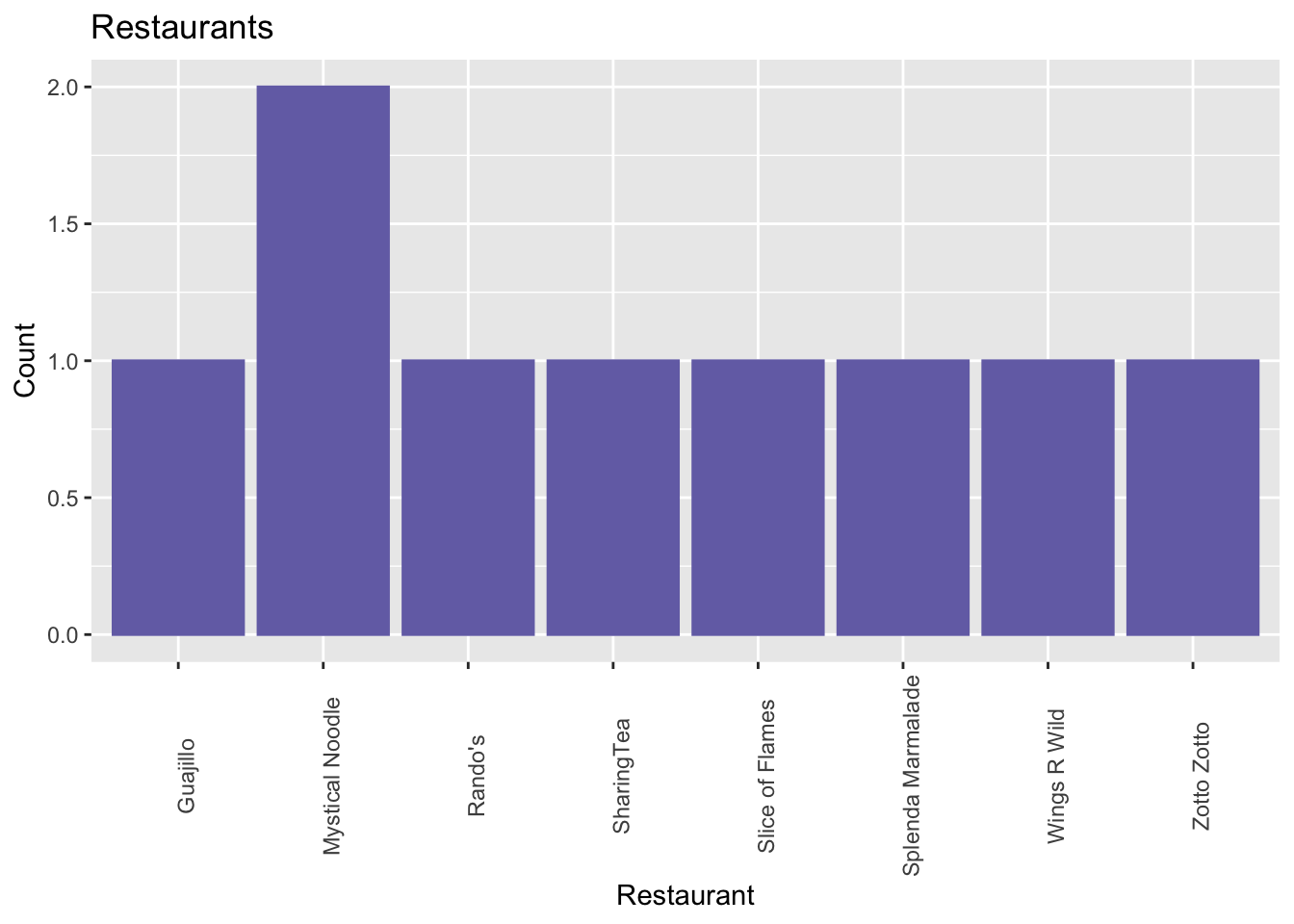
Looks like we ordered from Mystical Noodle twice as many times as any other restaurant! This doesn’t mean much though, since we’ve only eaten at a total of eight restarants this month, and only once at every other one.
We can do the same with the restaurants’ cuisine categories, too.
orders %>%
  ggplot(aes(x=category)) +
  geom_bar(color = "#66a61e", fill = "#66a61e") +
  ggtitle("Cuisine Categories") +
  theme(axis.text.x = element_text(angle = 90)) +
  xlab("Category") + ylab("Count")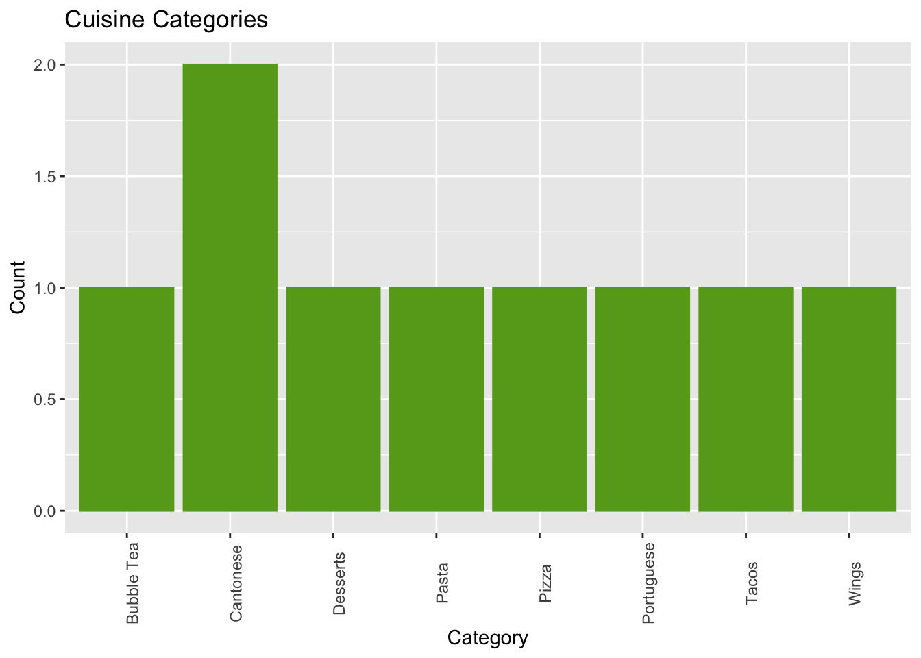
Our favourite cuisine category of the month so far seems to be Cantonese, although not by much.
6.4 Patterns
We noted earlier that promo codes may influence our ordering habits. We can visualize the relationship between order totals and promo code % discounts with a scatterplot. Again, we make use of the ggplot2 package, but this time using the function geom_point().
scatter <-
  orders %>%
  ggplot(aes(x=promo_percent, y=order_total)) +
  geom_point(color = "#1b9e77", fill = "#1b9e77") +
  ggtitle("Order Total vs. Promo Code Discount") +
  theme(axis.text.x = element_text(angle = 90)) +
  xlab("Promo Code Discount") + ylab("Order Total")

scatter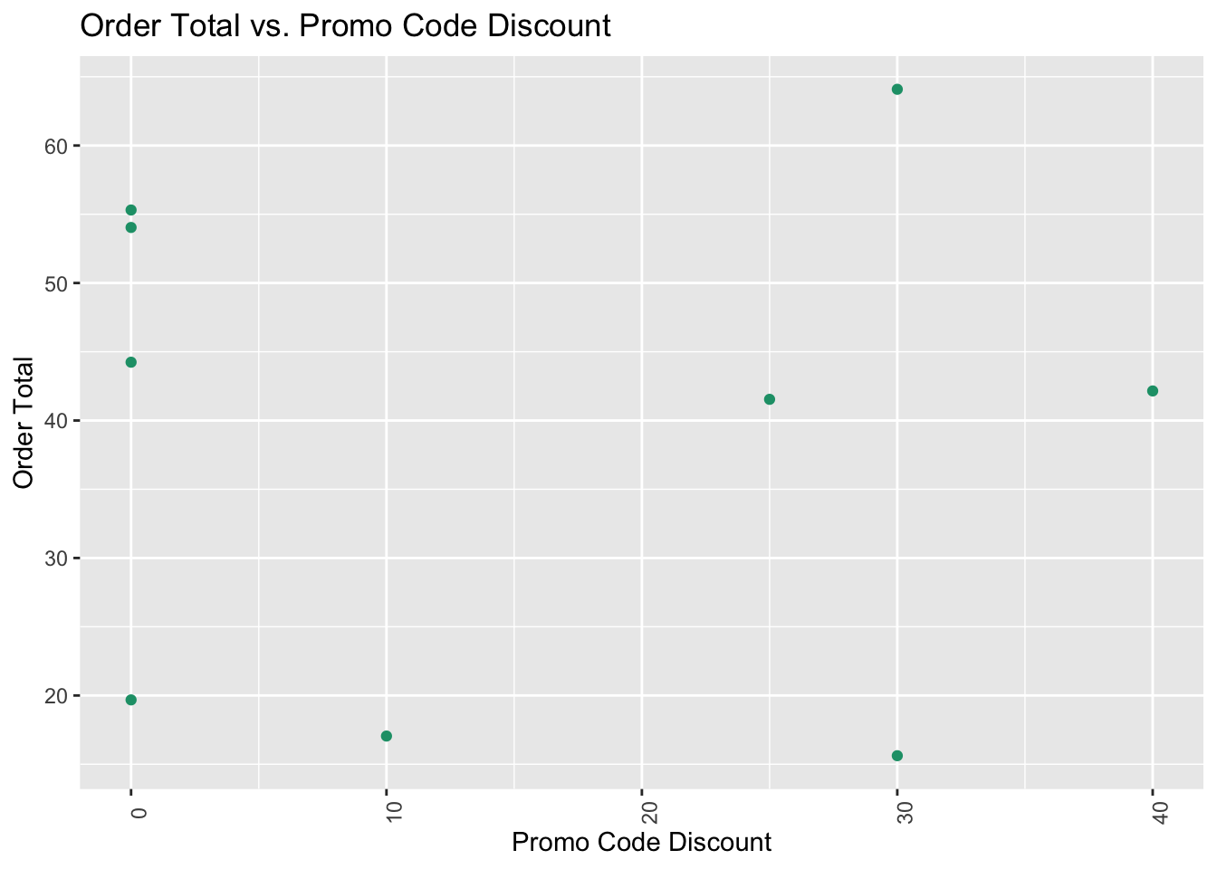
At first glance, we don’t see any obvious patterns.
But! We can also fit a straight line to the points to help us see any patterns. Here, we do so using the geom_smooth() function, again, from the ggplot2 package.
scatter + geom_smooth(method="lm")
#> `geom_smooth()` using formula 'y ~ x'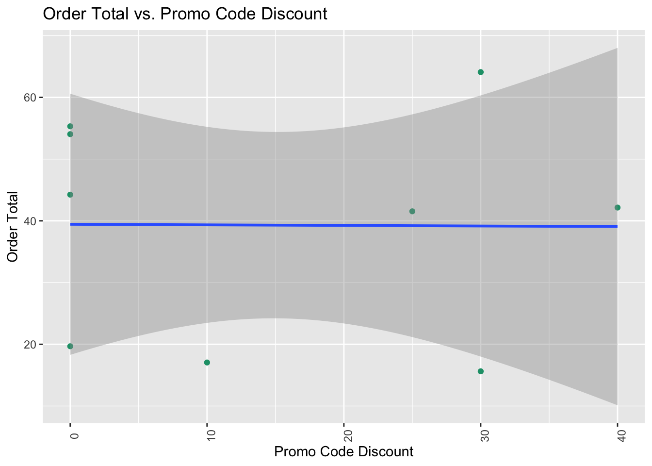
We get a horizontal line, so it seems there isn’t any relationship between promo code discounts and order totals. We’ve only ordered nine times so far, so we just may not have enough data to see a pattern yet. For the sake of data, looks like we’re going to have to make more SuperNoms orders!