73 Overview of ggplot2
Written by Shirley Deng and last updated on 7 October 2021.
73.1 Introduction to ggplot() through the scatterplot
Have you ever made a plot in base R? It’s not very pretty.
Consider the scatterplot.
73.1.1 What is a scatterplot?
In a scatterplot, each observation is graphed as a point on a grid with axes x and y.
We determine the position of each point based on the values of two numerical variables: the horizontal x-axis, and the vertical y-axis.
73.1.2 Let’s look at an example of a scatterplot
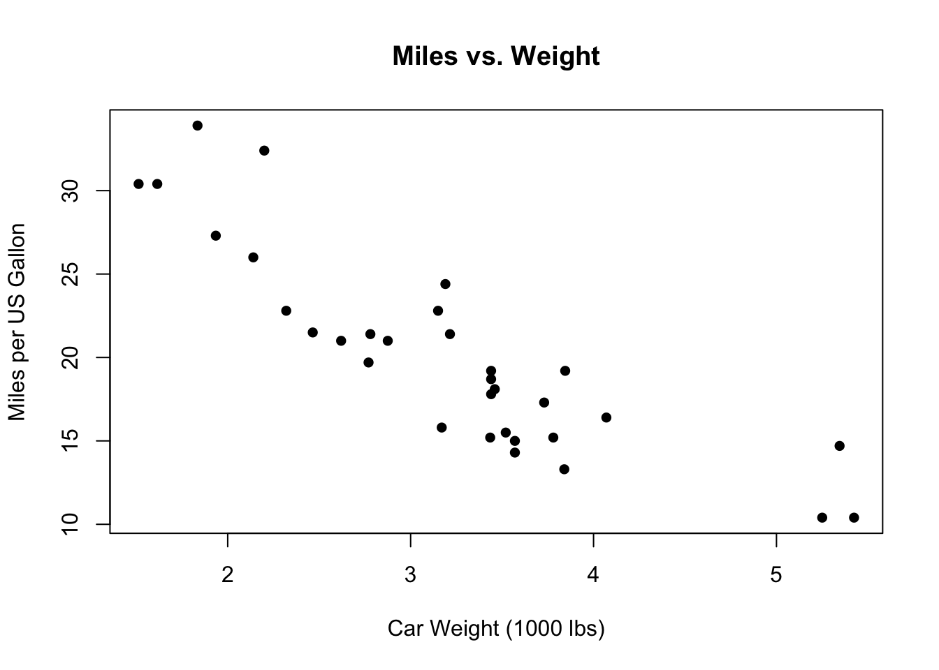
We can make one right now using the built-in mtcars dataset to take a look - below is a scatterplot made with base R.
plot(x = mtcars$wt,
     y = mtcars$mpg,
     main = "Miles vs. Weight",
     xlab = "Car Weight (1000 lbs)",
     ylab = "Miles per US Gallon",
     pch = 16
)
Alternatively, we can make the same plot with the ggplot2 package, using ggplot() and geom_point().
mtcars %>% ggplot(aes(x = wt, y = mpg)) +
  geom_point() +
  labs(title = "Miles vs. Weight",
       x = "Car Weight (1000 lbs)",
       y = "Miles per US Gallon") +
  theme_classic() +
  theme(plot.title = element_text(hjust=0.5))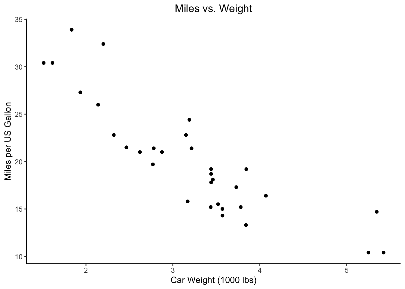
But ggplot2 also allows us to customize our plots, and even plot them together as one figure.
library(ggpubr)

base_plot <- mtcars %>%
  ggplot(aes(x = wt, y = mpg))

grey_plot <- base_plot +
  geom_point(color = "#7570b3") +
  labs(x = "Car Weight (1000 lbs)", y = "Miles per US Gallon",
       caption = "Using theme_grey()") +
  theme_grey()

minimal_plot <- base_plot +
  geom_point(color = "#66a61e") +
  labs(x = "Car Weight (1000 lbs)", y = NULL,
       caption = "Using theme_minimal()") +
  theme_minimal()

theme_plots <- ggarrange(grey_plot, minimal_plot)
theme_plots_title <- text_grob("Miles vs. Weight", face = "bold")
annotate_figure(theme_plots, top = theme_plots_title)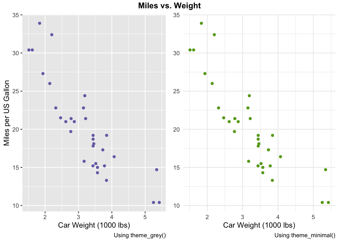
Looks cleaner, right? Or at least more fun.
73.2 Using ggplot()
73.2.1 What is ggplot() for?
ggplot2 is a package that allows us to make graphics in R. It’s a part of the tidyverse, so when you load the tidyverse package, you’ve loaded ggplot2 too.
The ggplot2::ggplot() function is used to initialize plots in R. We use it to indicate the base of our plot - what data we’re working with, and any plot aesthetics we’ll be using.
From there, we can add on layers to specify what the actual plots will be. This includes information on the type of graph we want, what we want its axes to look like, what we want its labels to look like, etc.
It may seem farfetched now, in the middle of a panoramic, but imagine going to a restaurant to eat.
You’d get seated in the restaurant you’re going to eat in before you start to order food. We can think of ggplot() as getting seated in the restaurant, and adding additional layers as ordering food. You can add as many layers as you want at any time, just like how you can also order as many menu items as you want at any time.
73.2.2 What arguments does ggplot() take?
-
.data: the dataframe we’re working with as a base -
.mapping: the aesthetics we’re working with as a base - more on this below.
73.2.3 What are aesthetics?
That’s a separate course in philosophy.
But, for our purposes, this argument is used to specify which variables of the dataframe we want to use for our plot’s axes, among other options.
For example, with our mtcars example from earlier, we wanted the wt variable on the x-axis and the mpg variable on the y-axis, so we used mapping = aes(x = wt, y = mpg).
73.2.3.1 Exercise 1
What if we wanted to switch the axes, with mpg on the x-axis and wt on the x-axis? Try modifying the code below to generate the plot.
mtcars %>%
  ggplot(aes(x = wt, y = mpg)) +
  geom_point() +
  labs(title = "Weight vs. Miles",
       x = "Miles per US Gallon",
       y = "Car Weight (1000 lbs)")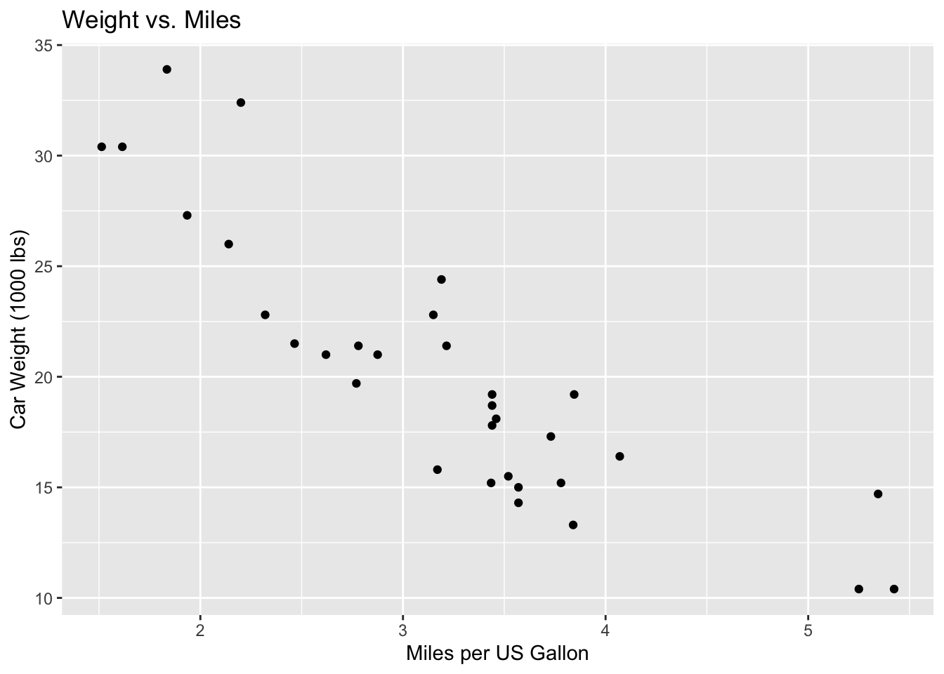
aes(x = mpg, y = wt)
#> Aesthetic mapping:
#> * `x` -> `mpg`
#> * `y` -> `wt`
73.2.4 What else do we need to use ggplot() ? Layers
Once we’ve set our ggplot() aesthetics, we need to specify what exactly we want to plot by using layers. This includes the type of plot - we use geom layers to do so.
73.2.4.1 Geoms
Some common geoms include:
-
geom_bar()- bar plot -
geom_boxplot()- box and whiskers plot -
geom_histogram()- histogram -
geom_point()- scatterplot
In Exercise 1 and our previous examples, we used geom_point() to specify that we wanted to plot a scatterplot.
73.2.4.2 Example 1 - the +
Let’s take a look at the following example:
mtcars %>% ggplot(aes(x = wt, y = mpg)) +
  geom_point() +
  labs(title = "Miles vs. Weight",
       x = "Car Weight (1000 lbs)",
       y = "Miles per US Gallon")
After we called ggplot(), we used a + to connect it with our geom_point().
Similarly, we added another layer - labels. We used another + to connect the labels labs() with the rest of the figure.
73.2.4.3 Themes
There are also layers for changing the appearance of our plots. For example, we can use the theme theme_void() to remove the axes and axes’ labels:
mtcars %>% ggplot(aes(x = wt, y = mpg)) +
  geom_point() +
  labs(title = "Miles vs. Weight",
       x = "Car Weight (1000 lbs)",
       y = "Miles per US Gallon") +
  theme_void()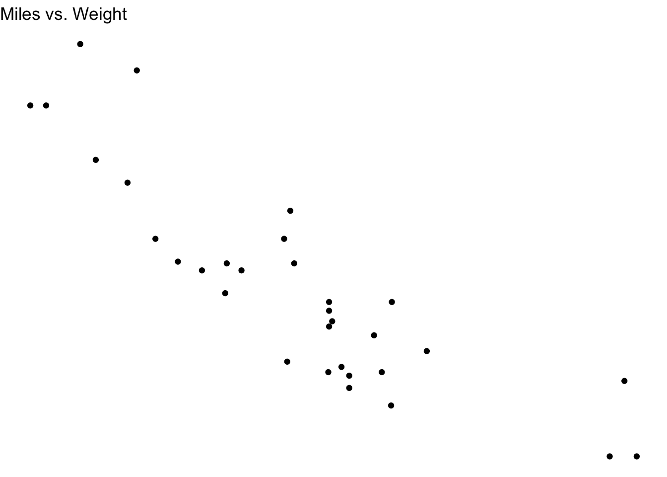
Not the ideal theme for this plot, since removing the axes and their labels leaves us with little information on what’s being plotted. But, we know we have the option to change the theme!
A list of themes can be found in the ggplot2 documentation here.
73.3 Handy Layers
We were introduced to geoms, labels and themes in the previous section.
But there are a number of other layers you might find handy for making plots and figures with ggplot():
73.3.0.1 Labels
We saw earlier that we could specify labels using labs(), like in Example 1:
mtcars %>% ggplot(aes(x = wt, y = mpg)) +
  geom_point() +
  labs(title = "Miles vs. Weight",
       x = "Car Weight (1000 lbs)",
       y = "Miles per US Gallon")
But we can also make the exact same plot by specifying labels separately, in their own layers, with ggtitle(), xlab(), and ylab():
mtcars %>% ggplot(aes(x = wt, y = mpg)) +
  geom_point() +
  ggtitle("Miles vs. Weight") +
  xlab("Car Weight (1000 lbs)") +
  ylab("Miles per US Gallon")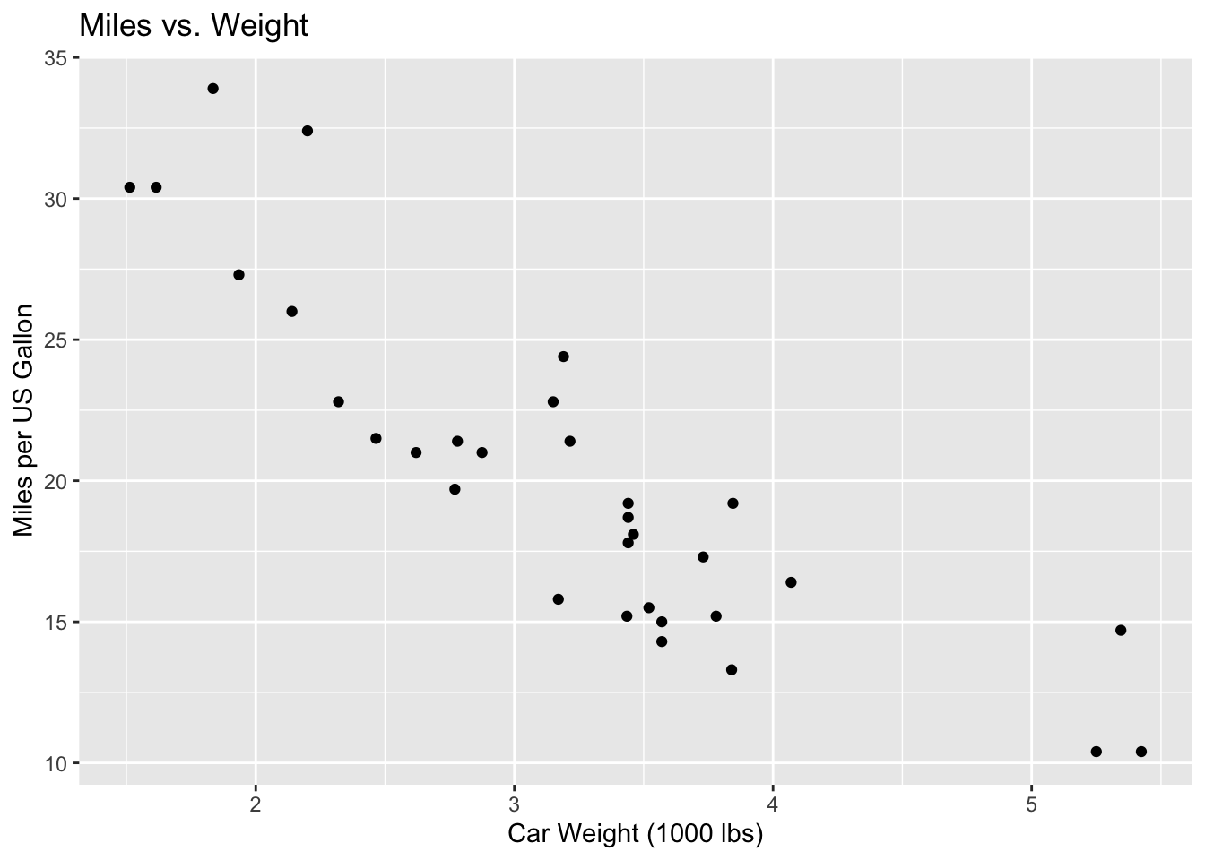
73.3.0.2 Adjusting title positions using the theme layer
Notice from our Labels section examples that by default, ggplot() will position our titles to the left.
We can position the title to the centre using the theme layer: theme(plot.title = element_text(hjust=0.5)):
mtcars %>% ggplot(aes(x = wt, y = mpg)) +
  geom_point() +
  labs(title = "Miles vs. Weight",
       x = "Car Weight (1000 lbs)",
       y = "Miles per US Gallon") +
  theme(plot.title = element_text(hjust=0.5))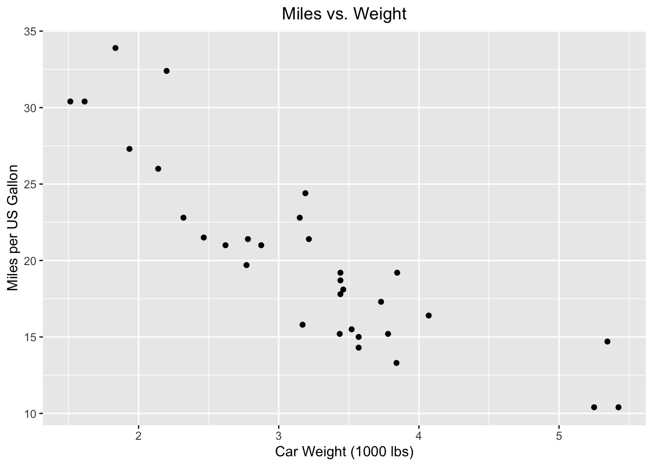
Similarly, we can adjust the title to the left with hjust=0 (the default), or to the right with hjust=1:
73.3.0.2.1 To the left, to the left…
mtcars %>% ggplot(aes(x = wt, y = mpg)) +
  geom_point() +
  labs(title = "Miles vs. Weight",
       x = "Car Weight (1000 lbs)",
       y = "Miles per US Gallon") +
  theme(plot.title = element_text(hjust=0))
73.3.0.2.2 Writing to the right-ing
mtcars %>% ggplot(aes(x = wt, y = mpg)) +
  geom_point() +
  labs(title = "Miles vs. Weight",
       x = "Car Weight (1000 lbs)",
       y = "Miles per US Gallon") +
  theme(plot.title = element_text(hjust=1))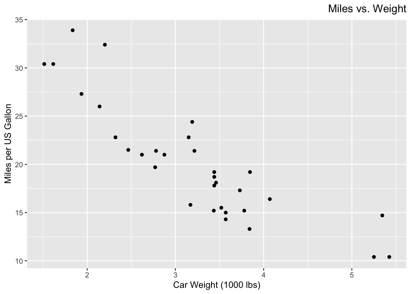
73.3.0.3 Axis scale limits
Notice how in our previous plots, the y-axis started at 10.
But this doesn’t give us an accurately scaled representation of the relationship between the x-axis and y-axis variables, so we may prefer to start the y-axis at 0 instead.
We can change the axis scale limits using the xlim() and ylim() layers.
Here, we set the x-axis scale to range from 0 to 6, and the y-axis scale to range from 0 to 35:
mtcars %>% ggplot(aes(x = wt, y = mpg)) +
  geom_point() +
  labs(title = "Miles vs. Weight",
       x = "Car Weight (1000 lbs)",
       y = "Miles per US Gallon") +
  xlim(0, 6) +
  ylim(0, 35)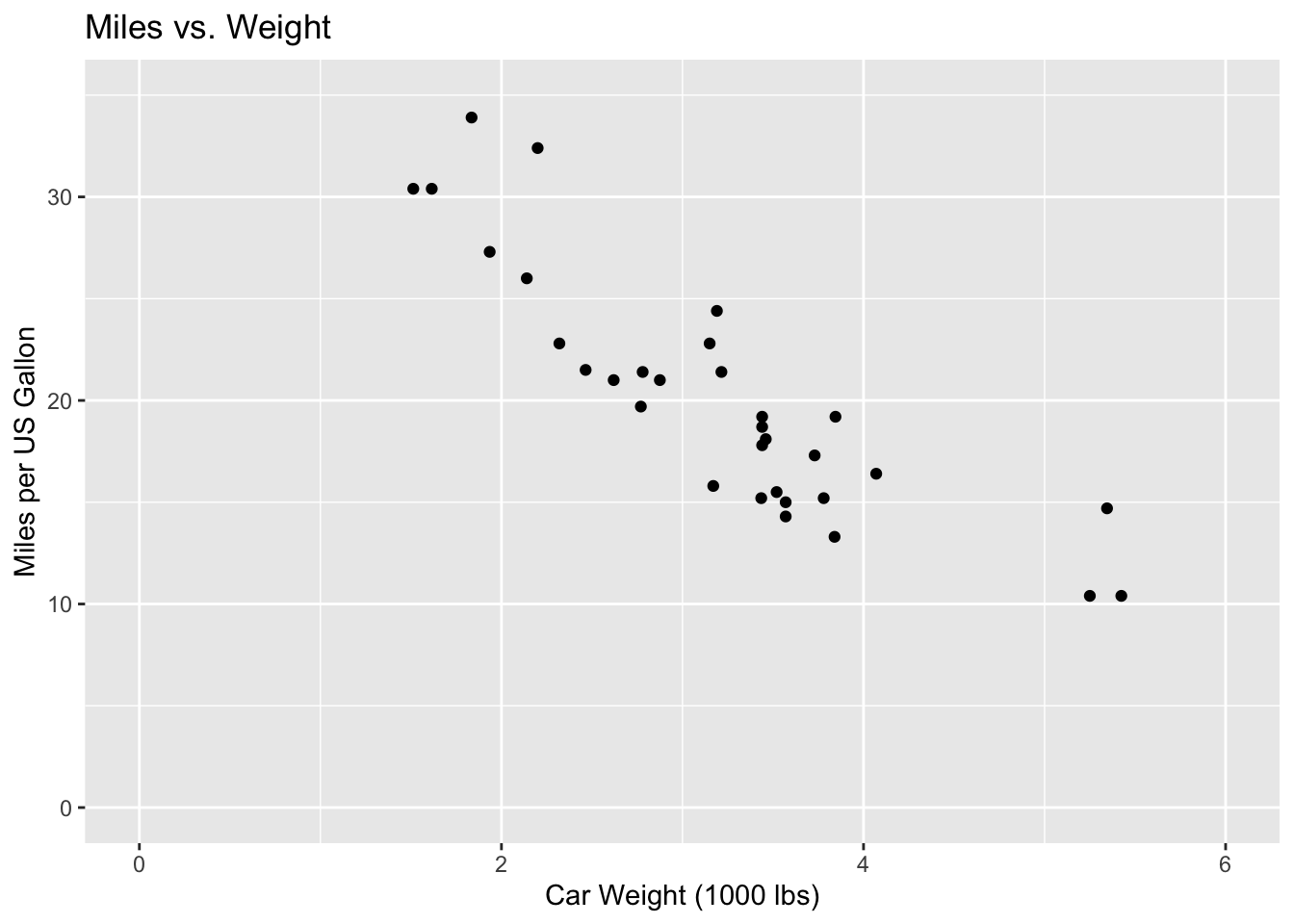
73.3.0.4 Axis text angle
Suppose we wanted to change the orientation of our axis labels’ scales.
We can do so with the theme() layer.
For example, we can rotate the y-axis scale labels by 90 degrees as so:
mtcars %>% ggplot(aes(x = wt, y = mpg)) +
  geom_point() +
  labs(title = "Miles vs. Weight",
       x = "Car Weight (1000 lbs)",
       y = "Miles per US Gallon") +
  theme(axis.text.y = element_text(angle = 90))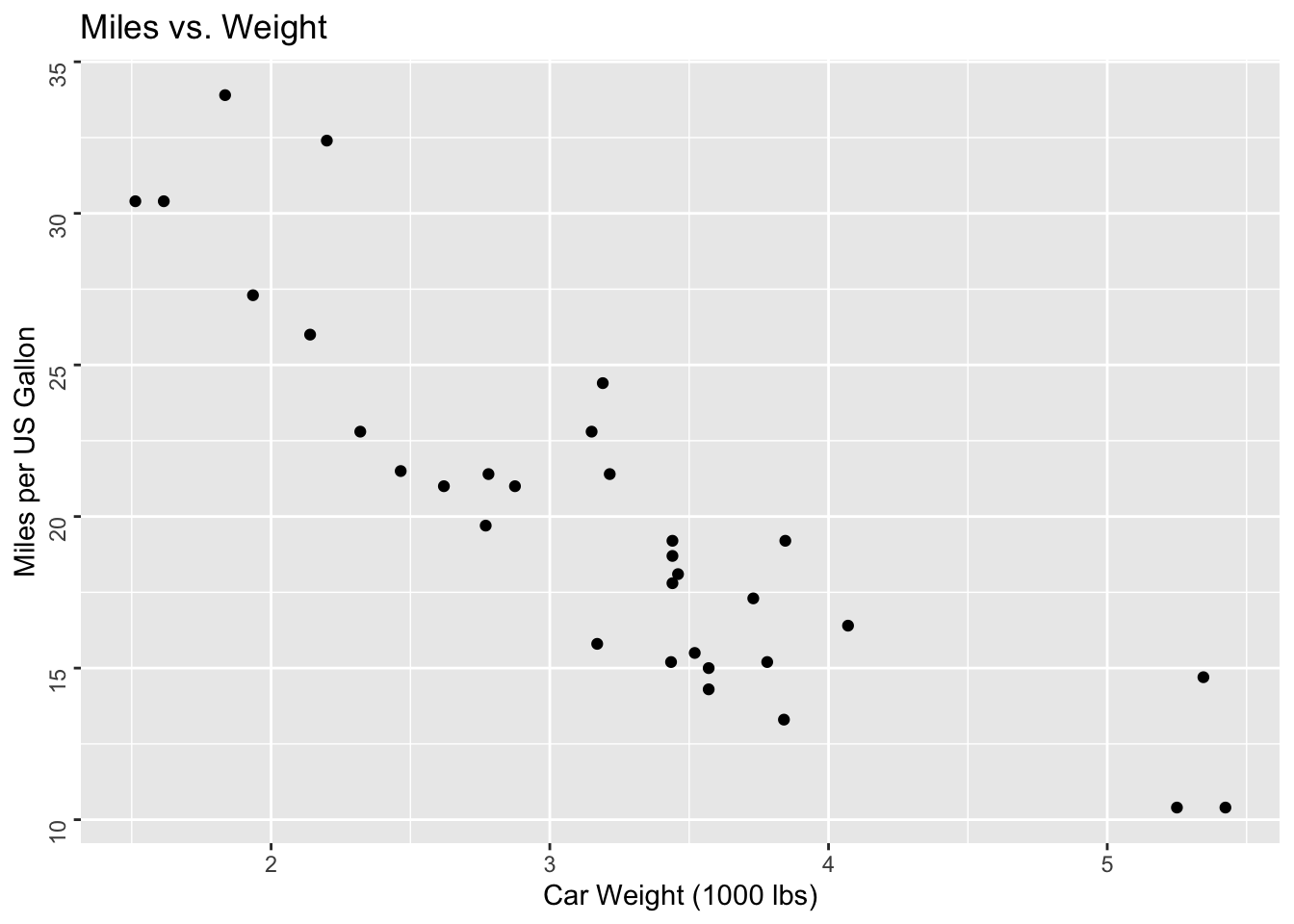
Notice that this only changes the angle of the axis scale labels, and not the labels themselves!
We can similarly change the x-axis scale label using axis.text.x in place of axis.text.y.